Remarkable experimental typefaces and how to use them
Far from your everyday geometric sans-serif, this collection of edgy and intriguing display typefaces will inspire you.

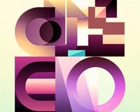
Typeface design by Studio Triple.

Carrie Cousins
Typography is at the core of the personality and style of a design project.
A type choice can blend into the background with subtlety that helps clearly communicate messaging or serve as a dominant visual force that pushes the design forward. Either way, typeface design is an important element in any project.
Experimental typefaces can help add a powerful edge or the right feeling to a design. They often serve as artistic and typographic elements concurrently. But experimental typefaces aren’t always bold and bizarre; this type style encompasses anything new and interesting that pushes type norms just a little outside of the usual comfort zone.
Here’s a guide to everything you need to know about experimental typefaces with a selection of some great examples to try in your projects.

What are experimental typefaces?
Experimental typefaces are generally of the display family, and have an unexpected look or interaction, such as animation, different x-heights, or a general disregard of the rules of letterform shape and spacing.
These text styles include quirky lines, colors, and letterforms. They have flair and plenty of personality.
But that’s not always the case.
“I think there might be a misunderstanding about this term of ‘experimental.’ We tend to use it to describe display typefaces that look either new or weird or disturbing,” says Jérémy Landes, Art Director & Type Designer at Studio Triple .
“The question of the design process behind the creation of these typefaces, and the question of the experimentation in the design process, is not really the point. Anyway, it seems to me that this term tries to convey the idea of a certain novelty, an avant-garde in the display genre,” he notes.
The definition of an experimental font may not be truly solidified, but you can think of it like this: An experimental font is anything that bucks the rules of traditional type design.
What might be most important when designing or using experimental or expressive typefaces is the push and pull between uniqueness and readability.
When working with this kind of type element, there’s a delicate balance between typography as art and typography to convey a message.
According to Jérémy Landes, while experimental typefaces stand out for their innovation, the main criteria to examine them is audiences’ reactions. “They feel new, but the question behind a successful experimental typeface is more one of the Zeitgeist. Will people relate to it? Will people be intrigued by this novelty, more than repelled? The question of why a creation, and a typeface, is successful at one point in time is for me the most intriguing one.”
Before conducting any type of design experiment, it is important to think about how it will resonate with your core audience and overall messaging.
Related: What a queerer design industry might look like: more expressive, collective and subversive
“The question behind a successful experimental typeface is more one of the Zeitgeist. Will people relate to it? Will people be intrigued by this novelty, more than repelled?"
Types of experimental typefaces
Experimental typefaces can have a variety of purposes–purely aesthetic, commercial display, or to promote a specific goal, such as social or promotional engagement.
Visually, these typefaces come in a lot of forms:
Color fonts
Variable fonts
Handwritten fonts
Custom novelty
Illustrated or artistic lettering
Three-dimensional
10 remarkable experimental typefaces
1. solide mirage.
Monospace | Free, open source
Design: Velvetyne Fonts
Solide Mirage was originally designed as a custom typeface for French-British music band, Frànçois and the Atlas Mountains . The band and designer decided to release the font as free and open source, to be used by fans as well as anyone else who appreciates its experimental aesthetic.
This unicase display typeface combines upper and lowercase characters together, resulting in a somewhat haphazard look. It was inspired by the Didone genre, while putting a new spin on the classic style with compressed shapes and long, elaborate serifs, especially on letters with ascenders or descenders. The typeface supports the Latin and Greek writing systems, and has ornamental alternates for some of the letters, shaped as squiggly zig-zags.
Consider using this font for branding. Note that while it is highly readable with some character combinations, others can be more difficult.

2. UltraSolar Normal
Sans serif novelty | Paid
Design: Adrien Midzic for Pizza Typefaces
This experimental typeface is highly readable and includes quirky details such as cutouts and missing curves. These details are inspired by traditional ink traps in typography, only that in this case, the missing details are stylistic interpretations and aren’t meant to be filled with ink in the printing process.
Best use cases would include titles and headers, or a short word or phrase in a display space.

3. Grind Grotesque
Sans serif | Free, open source
Design: Mickaël Emile
This open source font boasts an extremely wide stance, and is adequately named after the sliding stunt performed in extreme sports. In that vein, it’s best used with extreme design intent. The letterforms are sharp and compressed, with long straight lines and very little curves.
4. Euphoria
Novelty typeface | Paid
Design: Janik Sandbothe for Typelab
With hairline-thin strokes and pronounced, bubble-like terminals, this typeface turns to an Art Nouveau magazine cover illustrated by Ludwig von Zumbusch for inspiration. This expressive all-caps font features a single stroke design, as if scribbled lavishly in one go.
Its play on stroke width contrasts and free-flowing curves provide a lot of visual interest for display usage.
5. Digestive
Novelty | Paid
Design: Studio Triple
This font takes inspiration from Gothic architecture, Art Nouveau, seaweeds and human anatomy. The type design strikes a balance between attraction and repulsion, mixing tall proportions with loose, fluid shapes.
Digestive is a type family of seven fonts, ranging from super compressed to wide. This experimental typeface is best used for large text, and adding generous letter-spacing can help improve its legibility.

6. Cascadeur
Modular and variable font | Paid
Design: Peter Bushuev for Naum Type Foundry
This experimental typeface is a modernist homage to space-age typography. Its design is based on a four-lines grid, and together with it’s very tight kerning it creates a sense of filling up the space. The Cascadeur type family is made up of 12 styles and a variable font, supporting a variety of languages. Most letters come with two to four alternates.
This typeface is perfect for a design featuring oversized headlines or type for digital display or print. It would also work well as a primary artistic element.

7. Russibani
Novelty typeface
Design: Sveinn Þorri Davíðsson and Siggi Eggertsson
Aptly named Russibani, meaning roller coaster in Icelandic, this experimental typeface takes inspiration from roller coaster rails, using a single, continuous line for each letterform. The result is a pixelated-like appearance that gives off a mechanical feel.
Best uses may include branding projects or as the type treatment for a main headline or other large lettering.

Animated sans-serif | Paid
Design: James van den Elshout and Hans Renzler for Animography
This highly readable typeface includes 64 adjustable controllers, with each letter composed of six modifiable strokes. You can tweak this font’s motion speed, color, stroke width, and many other features, allowing for versatile uses of the same design.
Lovelo, which offers uppercase letters and extended Latin glyphs, can be downloaded either as a JSX file or an After Effects project. This typeface works best on a solid background as a decorative text element.
9. Singdings
Dingbat-based display | Paid
Design: Fable Type Foundry
With illustrative touches and a hint of whimsy, this experimental font features architectural landmarks and other objects from Singapore in honor of the country’s 55th birthday. The all-caps typeface offers 130 glyphs, with two to three alternates for each letter. These different versions allow designers to blend clean, geometric letters with unique dingbat-style ones, adding flexibility of use.
The specificity of the typeface dictates use somewhat, making it best fitted for projects related to its namesake, or in any design that calls for a palm tree as a capital T, a shrimp for a G and more.
10. David Milan : Hand lettering
Custom created lettering
Design: David Milan
While not an actual typeface, experimental typography can also take on the form of hand lettering. These unique renders of letterforms can add a bespoke touch to a design.
Based in Madrid, David Milan creates his lettering pieces either digitally or with markers and brush pens. His style ranges from hyper-realistic 3D designs, to looser strokes that highlight the human hind behind them. The typography itself also varies, going from handwritten script to cleaner capital letters.
When it comes to custom lettering and phrase design by a lettering artist, use and application is almost unlimited and can accommodate a wide range of design projects.
How do you use experimental typefaces?
Once you become enamored with the idea behind experimental typefaces, it is hard not to dive in. But you want to ensure that you’re using experimental typefaces the right way.
It’s important to consider whether these styles are appropriate for your audience or publication, the value of readability versus artistic value, and the overall relationship to your brand as a whole.
Here’s how you can make experimental typefaces work for your projects:
Use a typeface that feels like it goes with your brand. Experimental typefaces are funky by nature, so choosing an appropriate way to display them is important.
Mix it up. Using experimental typefaces can mean that you have to switch typefaces frequently for some text elements. Is that acceptable within your brand’s style?
Create a messaging match. A color font typically feels fun and light. Does that go with your content and tone? The same is true of any experimental typeface. Type in the words in the font you plan to use. What emotions or meaning come to you when you see it for the first time? Does that fit the goal of your messaging?
Build brand value. For startups or rebrands, an experimental typeface choice spark for a logotype or text element that becomes part of your brand’s visual story.
Think of typography as art. Not all typography is designed to read like a novel. For short words or phrases where the letters meld together in just the right way, type can be used as an artistic element. This concept can be a solid option if you find yourself in a project without a lot of other imagery.
That last point brings about a good question: How do you weigh readability versus the artistic value of an experimental typeface?
There’s no perfect answer. It really depends on your brand voice and tone in relationship to the font and aesthetic. But there are a few things you can do:
Test fonts, pay attention to analytics, and poll your audience. Do they understand what you are trying to communicate? Watch for red flags in your analytics such as drops in traffic, reduced time on site/page, and unclicked calls-to-action.
Pair an experimental typeface with a simpler, more legible font that reiterates key messaging.
Only use an experimental typeface with the finalized version of your UX copy. Don’t use placeholder text or elements that will auto populate, such as a header tag for webpages or a blog. These typefaces require attention and care that only comes with manual typesetting.
Experimental typography is one of those design tools that people tend to either love or hate. (I’m in the former category.) These typefaces are expressive, creative, and special.
They give type designers a chance to stretch with concepts, letterforms, and artistic vision.
The key thing when looking at typefaces in this category is toggling between readability and artistic value (more traditional fonts for websites here). Not all type styles have both, and it can be a determining factor when it comes to using an experimental typeface or not.
RELATED ARTICLES

Why is type inspired by '70s era candy so big right now?
ELIZABETH GOODSPEED
.jpg)
Expressive type is making us feel again, one ascender at a time
PERRIN DRUMM
.jpg)
Never be confused by typefaces vs. fonts again: here’s how they’re different
REBECCA STREHLOW
Find new ways FWD
Thanks for submitting!
By subscribing, you agree to receive the Wix Studio newsletter and other related content and acknowledge that Wix will treat your personal information in accordance with Wix's Privacy Policy .
Do brilliant work—together
Collaborate and share inspiration with other pros in the Wix Studio community.

20+ Breathtaking Experimental Typefaces

Typefaces are so much more than mere tools for written communication. Not only does the choice of a right font help you transmit messages in a striking way, but it also adds desired context and personality to any project, be it a book, a website, packaging, or brand design.
When it comes to experimental typography, the importance of lettering becomes indisputable. Experimental type is often at the epicenter of a project and can be so important that it becomes the designer’s primary visual tool . When handled masterfully, this kind of typography becomes bigger and more important than the message it was meant to convey.
Experimental typefaces can be purely artistic, comercial, or even used as a means of social engagement. But regardless of its use and character, it’s almost always powerful and potent. To show you just how dynamic and diverse typefaces can be, we’ve selected 20+ examples of experimental typography that perfectly illustrate the unbridled power of fonts.
Lovello – Animated Typeface
Lovello is an experimental, animated font from the Animography studio. Essentially, this is a highly-customizable, sans-serif kind of typeface. Each letter is made up of 6 strokes you can individually modify to create completely new and unique font styles. It’s possible to change the letter width, length, speed, visibility, color, as well as the offset of each stroke. In total, there are 64 controllers for you to play with, which allows you to craft an unlimited number of font variations adjusted to your needs .
Lovello also comes with 12 preset styles you can use as a starting point in your work. Customize them to your liking and create your own typography presets.
What makes this font particularly fit for any occasion is the possibility to use it in its basic form, i.e. as a filled, sans-serif typeface.
Kanibal Font

Kanibal is an award-winning font created by the young graphic designer Milos Zlatanovic. It’s a collection of various, seemingly unmatchable letters. From perfectly proportional, simple, and distinctly stylish letters, to illustrated and grotesque characters that appear to be on the move, every letter and consequently every word looks fresh and unpredictable.
But ultimately, the letters are harmonious and match well together, so you can use them for all kinds of projects, from fashion and pop culture, to science, sports, and politics. You can easily combine letters with subtle graphics and photos that’ll set the project’s tone, and then trust the Kanibal font to take care of the rest.
Stefan Sagmeister Typography

Typography is much more than just fonts and letters on a page. In fact, there are many examples of experimental typography performed in public spaces . Those temporary or permanent installations can carry an important message, and often employ a large number of people. Such was the typographic installation of Stefan Sagmeister on Waagdragerhof square in Amsterdam, which was laid out by more than 100 volunteers and built from 250,000 euro cent coins. This performance showed how typography can perfectly interact with the surrounding space, and how the impression it leaves on the observer changes depending on the weather and light conditions .

The Talas typography typography was custom made by the design agency Anti for a Norwegian beer brand called Talas. This typeface was created for practical purposes rather than purely visual demands. Every Talas letter is shaped like a bottle opener, which makes the font graphically interesting to look at .
Mondrian Font

Mondrian is a font created by Argentinian designer Tano Verona. It serves as an example in which the inspiration for the design of the typeface is drawn from the creative oeuvre of an artist (in this case, the great Piet Mondrian) or an artistic movement (here – neoplasticism). Precisely for that reason, fonts like this one are mostly used to pay homage to an artist. Other than that, you can’t really use them in other contexts due to their obvious connection to a specific art style. This kind of typefaces usually contains only the basic symbols (letters, numbers, basic interpunction).
Royale Font

Designed at the Spanish studio Resistenza, the Royale font features lots of ornaments that evoke the Italian spirit in a melancholy manner. This typeface is wide-ranging , in fact, much more so than it initially may seem. It comes in 8 weights and 4 widths you can further layer to create interesting polychromatic effects . It’s easy to imagine this font on sophisticated cosmetic and food packaging, on handmade products, as well as on movie posters.
Vicente Animated Typeface
Vicente Animated Typeface is another font made by the Animography design studio that specializes in designing animated fonts for Adobe After Effects. This is a highly usable, eclectic font with a unique illustrative character . The sharp contrast between thick and thin lines, combined with vibrant, effervescent colors, smooth motions, and unusual shapes makes you think all your designs need is this typeface and not much else.
Matter Company Campaign

There are many examples of experimental typography performed in the real world, usually by using natural materials, food or flora. Sometimes, these projects even feature landscape compositions.
Authors usually set these installations up so they could photograph them, and then use them on posters, graphics, etc. And very often, these projects can be challenging to arrange.
The possibilities seem limitless and that’s why we’ve decided to introduce you to a work whose quality lies not in its complexity but rather in its subtle and visually pleasing expression.
We’re talking about the Matter Company campaign of the Night Shift studio that was created for a skincare company. Carefully and subtly arranged flora arrangements that blossom through layouts shaped as classic sans-serif letters look sophisticated, unpretentious, and warm.
Love Typeface

Love is the uppercase display font from French designer Jérémy Schneider. This sophisticated and elegant typeface, full of unusual shapes and proportions, has a wonderful flow . Big counter-forms and thin stems are beautifully contrasted. Each letter has at least 2 shapes, so you can create a myriad of letter alternatives . When combined with a large number of carefully designed ligatures, the Love’s rhythm becomes even more pronounced. It also gives a whole ‘homemade’ feel to your text.
Hygge Type Series

The Hygge poster is a personal project of the designer and illustrator Shaivalini Kumar. It’s the perfect example of how typography and letter forms can be a common starting point for authors who use illustration as a primary form of their artistic expression. Hygge is a Danish word used to describe ‘a feeling of coziness’, and this typeface represents the perfect hygge in the form of letters .
Top WordPress Themes for All Creatives

Portfolio & Agency Theme

Multi-concept Agency Theme
A Theme for Movie Studios and Filmmakers

Multi-concept Artist and Creative Agency Theme
The Beauty of Scientific Diagrams

The Beauty of Scientific Diagrams is an illustrated typography by Khyati Trehan. It’s made up of hand-drawn letters. Each letter of the alphabet stands as the initial of some great scientist’s first or last name, and it also illustrates the inventions those scientists are most known for . Because of that, this typeface is a great choice for academic texts. You just have to make sure its visual and graphic qualities are in sync with the surrounding textual content.
Pringles Galaxy

Big brands often rely on visually rich and striking 3D aesthetics to communicate with their customers. In such projects, typography is often really important, or central even. Pringles Galaxy is a 3D typography created by Chris Labrooy for Pringles. It’s designed so that the letters symbolize the ingredients Pringles products are made of . Just by looking at them, you’re bound to think of that specific Pringles flavor. The ways in which you can use 3D fonts are virtually limitless as they can convey any kind of message you want .
Criatipos Perhappines Mural

Criatipos Perhappiness is a typographic mural created by Christina Pagnoncelli and Cyla Costa, two visual artists from Brazil. The mural is painted in Brooklyn and it serves as a great example of social activism. It was created as an homage to Brazillian poet Paulo Leminski. The narrow, decorative typography is at the forefront of this project . The letters are also beautifully adorned with warm and impressive floral illustrations.
Typop-up Book

Mónika Rudics’ Typop-Up Book addresses the basics of typography and typographic rules. The letters are richly illustrated with modern colors and textures, and are further accentuated by stunning pop-up effects .
Solutions like this are great for design projects where a user comes into direct contact with the product. Besides books, similar examples of interaction can be found in packaging design. But interaction design is not restricted to typography only, and is obvious in other design elements too, such as illustrations, etc. Because of their interactivity, these solutions are ever-interesting . They often outlive their original purpose and become a separate object with a whole new value on their own.
Inner West Identity

The visual identity of the Inner West brand serves as an example in which typography, used in a logotype design, has extended its purpose and has become a means of communication between the brand and its users. Visually rich and fluid, made up of simple, modular shapes, this type of font can be a great starting point for a myriad of projects . It can be used in the design of basic marketing materials, when creating decorative murals, in various types of campaigns, for spatial identification, and illustrative infographics.

The Valaire ’s Oobopopop album cover was created by Canadian creative studio Caravane. It looks like a visually rich set in which masterfully designed and carefully placed letters have an important role . The whole scene, typography included, is not computer-generated, but produced on the set and then photographed.
Copenhagen is an animated font by Mat Voyce. It serves as another example of how simple letterforms can become a canvas for artists to express themselves . Every letter represents an autonomous thematic unit. The animations are gentle and their rhythm is uneven. But they align in perfect harmony when all 10 letters are placed next to each other forming the word – Copenhagen.
Finansleasing Evolution Campaign

The scope of the Finansleasing Evolution Campaign was to demonstrate the benefits of leasing over buying. Some visually interesting solutions were created for this project, mostly by using various stylized graphic elements, such as cars, computers, printers, and other additional equipment . When put together, these elements create some pretty surprising typographic units that overpower the purpose of their basic components.
Campaigns like this mix the aesthetic of a premium product with recycling, and the artistic expression with functionality.
Fox Tale Gin packaging

Hand-drawn typography is at the forefront of the Fox Tale ’s label and packaging design. It’s adorned with lots of details and ornaments, often in various colors and made of different materials . In most cases, it can stand as a caption on its own, independently from the brand logo. Its purpose is to capture the viewer’s attention, to stun, and to glue together all the surrounding design elements. This visually sumptuous style is further enriched by the use of embellishments and rich textures.
Chingones hasta en la muerte

The Chingones hasta en la muerte campaign was made for Victoria beer, in celebration of the Day of the Dead. Even though it was created using the 3D animation technique, its multiple glossy, plastic-looking objects leave no impression of perfection, but preserve the warm feeling hand-crafted items emanate . The pleasant sensation is further enhanced by the way in which other design elements and materials are stylized.
Cities in Motion
Cities in Motion is an impressive project of the Dutch studio Dumbar. It is a series of motion graphics made for info screens located in railway stations across the Netherlands . Each graphic depicts the name of the corresponding city in a playful, visually-pleasing way. As such, they capture the travelers’ attention and fulfill their primary, informative role. The Studio Dunbar has designed and developed a special kind of typeface for this project, with letters that change their shape according to a self-developed script.
Final Thoughts
Experimental typography is a great art form that can make your projects really come to life. Each example we featured in our list simply oozes creativity and leaves a lasting impression on the user.
As you could see, there are no limits to which elements, materials, textures, and techniques you can combine to create stunning typography pieces. Striking typeface choices can help you accentuate the message or emotion you want your projects to convey. Just be open-minded, explore what some of the best type foundries have to offer, and don’t be afraid to use groundbreaking techniques in your work.
How to Create a WordPress Website: The Ultimate Guide
10 captivating examples of the liquid metal effect in web design, 10 examples of imaginative mouse cursor design, 10 examples of innovative contact form design, 10 examples of websites inspired by poster aesthetics, 10 google font combinations for inspiration, 10 inspiring design podcasts to listen to while you work.

Post your comment cancel reply
Save my name and website in this browser for the next time I comment.
Post your comment
Design Trend: Experimental Typefaces & Fonts
One of the biggest trends in website design is experimental typefaces. These funky, unique, and always special fonts can serve as the backbone of a project or provide a special spark.
Experimental typefaces come in a variety of formats from handwriting styles to interesting serifs to color or animated fonts. There’s something for everyone with fonts that are a little bit different (or even customized).
Here’s a look at this design trend and how to make it work for you.
19 Million+ Digital Assets, With Unlimited Downloads
Get unlimited downloads of 19+ million design resources, themes, templates, photos, graphics and more. An Envato subscription starts at $16 per month, and is the best unlimited creative subscription we've ever seen.
Graphic Templates
Logos, print & mockups.
Icons, Vectors & More
CMS Templates
Shopify, tumblr & more.
Explore Design Resources

What is an Experimental Typeface?
First impressions of these text styles include quirky lines, colors, and letterforms. They have flair and plenty of personality.
Moreover, experimental typefaces have a strong visual presence. Maybe the x-heights of characters differ or rules of letterform shape and spacing are abandoned. There may be hints of animation or an abundance of color.
What might be most important when thinking about, designing, or using experimental typefaces is the push and pull between uniqueness and readability.
Many of these typefaces are immensely unusual. That makes them beautiful and visually appealing.
So, when we talk about experimental typefaces it is important to think about display typography.
It’s also important to note that while some experimental typefaces have a fully polished and finished feel, many are imperfect and don’t have the same technical precision as something like Helvetica. While families and character sets tend to be more limited, you may find more glyphs, swashes, or behaviors that you would not find with more traditional typefaces.
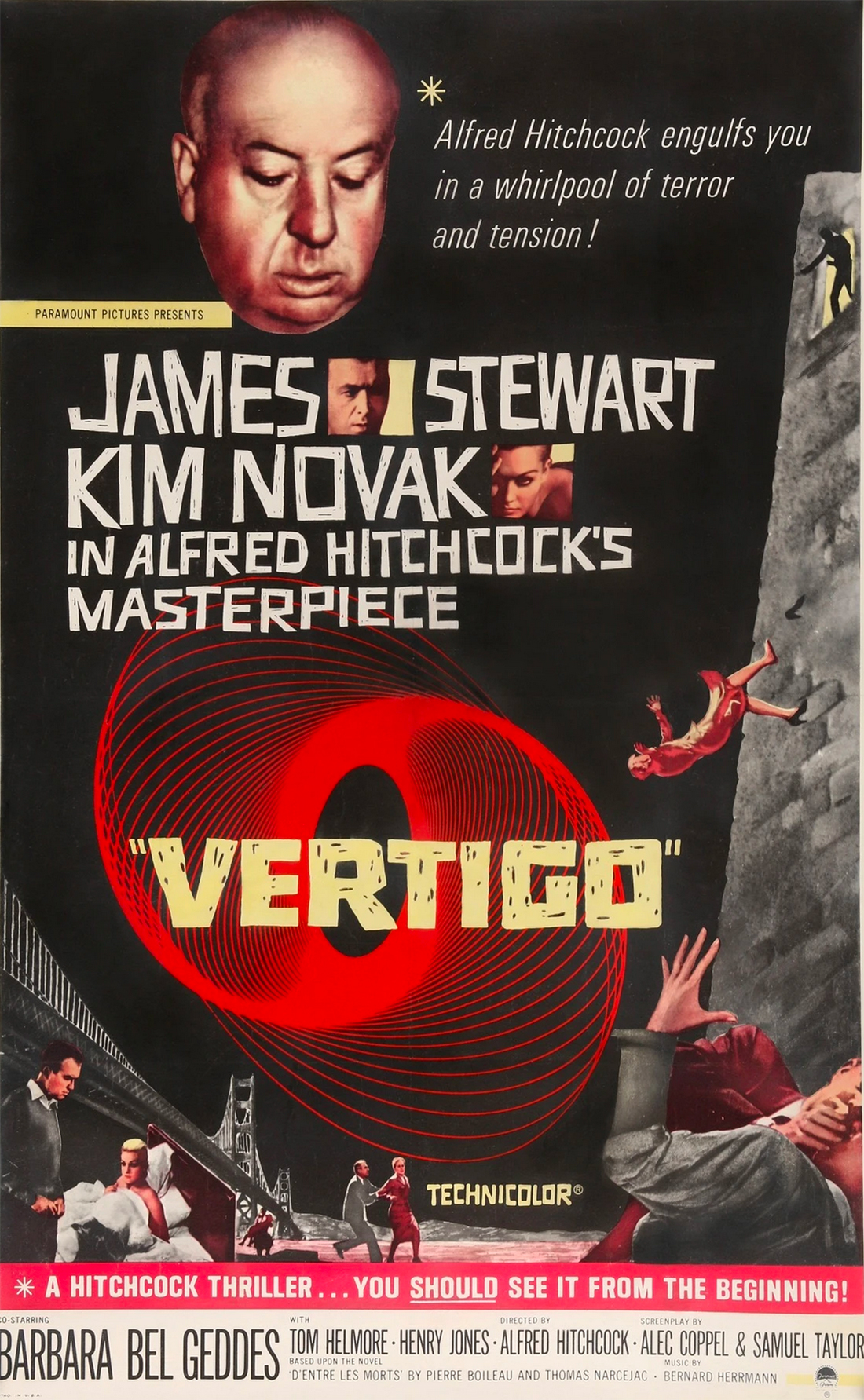
While this category of typography is “newer” to a website and digital design, it is not new. Experimental typefaces have been at the root of poster design for decades. Just look at the cool type treatment for the promotion of “Vertigo” (1958, above).
Search “iconic movie poster” and you’ll be flooded with decades of examples of experimental typography in action. While trends in typography change, much of what defines this style remains the same.
Characteristics of Experimental Typefaces
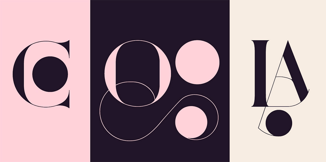
A key characteristic of the style is overall creativity which shows words, letters, and individual characters in a different way.
Sometimes this means they can be difficult to read.
When working with this kind of type element, there’s a delicate balance between typography as art and typography to convey a message. Use experimental typefaces with enough supporting elements – backgrounds, visual cues or images, text in other typefaces – to ensure that messaging is clear and understandable, even if the display type takes a moment to discern.
As with other typefaces, experimental styles can come in quite a few forms. Experimental typefaces can serve a variety of roles with a purely visual design, designed for a specific commercial or display purpose, or to draw attention to a project.
You may note that experimental typefaces can be:
- Edgy and funky with strange lines, missing strokes, or unusual swashes
- Animated or function with motion
- Three-dimensional
- Include illustrations as part or as the whole of the typeface
- Color fonts
- Variable fonts
- Truly custom with a style that only appears in one place
Tips for Using Experimental Typefaces Well

Experimental typefaces aren’t for everyone or every project. They work best when you have a specific typography goal in mind – such as creating a specific feel or using type as art.
Many of these type styles can create strong emotional vibes or limit readability, so having a goal is key.
When it comes to using experimental typefaces keep these things in mind:
- The experimental typeface is your one design “trick;” keep the rest of the project streamlined visually.
- Support experimental typefaces with highly readable secondary fonts to ensure your message gets across.
- Create ample contrast, including color and space, for experimental options. Color and animated fonts may need more room to breathe than some other styles.
- Most experimental fonts are best for display use and should be avoided in body copy or long blocks of text.
- Play with lettering and the actual words you plan to use. With highly interesting and unique styles, some fonts might not look great with some letter combinations. Work with ligatures, swashes, and overlaps to ensure you have the best typeface for your words.
5 Places to Find Experimental Typefaces
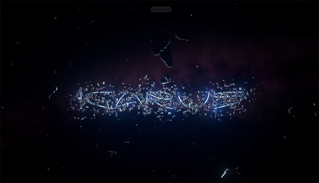
You can find experimental typefaces in all the places you traditionally look for fonts. Finding them is a know-it-when-you-see-it kind of thing.
There are free and paid options out there with many independent type designers offering experimental options. Mainstream foundries and typography vendors also have options in the style and some type houses even focus primarily on experimental styles.
If you are struggling to find an experimental option that works for you, try one of these five sources.
- Typelab: The studio includes more than 20 type designers and their projects. (They have a fun space promotion running now with cool animations of various typefaces, above.)
- Future Fonts: Find funky and high-quality fonts that are brand new and don’t have a lot of use. There’s plenty of experimentation happening here and you can buy typefaces before they are finished and get updates.
- Font Space: Browse more than 124 free typefaces that have been tagged experimental by the designer.
- MyFonts: With hundreds of premium options available this list includes everything from modern designs to lettering that is best suited as art.
- Envato Elements: With 48 options to choose from, you’ll find anything from scripts to variable fonts to animated styles.

5 Designs with Beautiful Experimental Typefaces

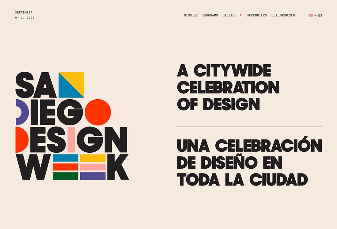
San Diego Design Week
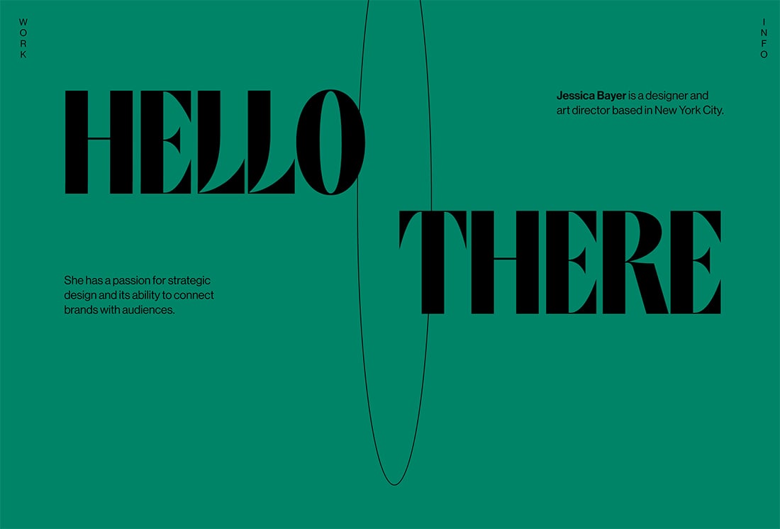
Jessica Bayer
Fiddle.Digital

The best part about working with experimental fonts is that you get to try something new. You’ll display a typeface that isn’t the overused Helvetica or Roboto and create personality for your project.
While these fonts aren’t for everyone, they can add a perfect finish to some projects with flair.
Foreign Imitation
Handwriting, experimental fonts, permalink to these settings, religath by enxyclo studio, kleptocracy titling +8 by raymond larabie, ncl bahie waonid by enxyclo studio, you're gone +1 by 1001 fonts, wonder varelia by enxyclo studio, kaijuz by dhabee studio, squeid gameis by dhabee studio, vorcas by rantautype studio, wheaton by raymond larabie, gahiboe by enxyclo studio.
Get a free custom homepage design for your new website.
Design, UI, UX , Insights , Inspiration , Website Examples
14 examples of trendy websites with oversized experimental typography, ui/ux design trends 2023: oversized experimental typography.
- By Sandra Boicheva
- October 21st, 2022
One of the most important aspects of any visual presentation is choosing the right fonts. And although the right tone and message are the base of any business, the visual performance will make it get across and impact. Oversized and experimental typography is a raising trend that helps designers accomplish that and unleash creativity to build eye-catching modern websites. This is why in this blog post we hand-picked 14 creative oversized experimental typography examples in the wild that will inspire you to try out this trend.
At the end of this post, we also answered the 3 most common questions about oversized and experimental typography.
Update Oct 2023: The UI/UX Design Trends of 2023 are out to replace minimalism with bolder, more diverse, and more experimental digital experiences. Check them out.
FAQ About Experimental Typography
- What is an Experimental Typography?
- What is the Difference Between Experimental Typography and Lettering?
- What is an Oversized Typography?
Examples of Websites with Oversized Experimental Typography
Let’s dive into some recent live or conceptual web design creations that use experimental typography to create a memorable user experience.
1. Charlie Le Maignan: Animated Experimental Typography
This portfolio website showcases the work of a Paris-based graphic and interactive designer who creates motion and typography. Right from the hero section, Charlie demonstrates some homebrew fonts decorated with experimental animations and effects.
- Experimental typography animations and effects purely for demonstration.
Live Website: Charlie Le Maignan / Designed by: Charlie Le Maignan (France)
2. Likely Story: Oversized Fonts and Parallaxes
This joyful site grabs attention with 3D characters and typography with personality. Staying on trend, the design uses oversized fonts for titles and background messages and mixes them with a nice parallax effect.
- The oversized main and background titles create a distinctive hierarchy.
- Subtle parallax effect.
Live Website: Likely Story / Designed by: Likely Story (UK)
3. Elva Design: Animated Typographic Hero With Personality
Elva is a design group creating branded e-commerce experiences, specializing in digital strategy, UI/UX, and motion. The hero section showcases simple, yet effective typography animation that replaces letters with icons.
- Simple but effective typography animation.
- Custom font and icons reinforce the brand.
Live Website: Elva Design / Designed by: Non-Linear Studio (USA)
4. Design Embraced: Trippy and Distorted
The portfolio of creative director and designer Anthony Goodwin goes further with typography experiments by adding an interactive distortion effect on hover.
- Clean background with oversized typography, floating images on scroll, and distortion effects on hover.
Live Website: Design Embraced / Designed by: Design Embraced (UK)
5. Playground Paris: Playing Around With Colors
Another great example of a typographic hero with oversized fonts, this time experimenting with colorful effects on hover. Reading the title description gets fun, which is pretty fitting for a graphic design studio named Playground.
- Custom big bold fonts with colorful hover effects.
Live Website: Playground Paris
6. Angela Milosevic: Dark and Surrealistic
The portfolio site for art director and digital designer Angela Milosevic greets you with an overlay image and oversized typography with custom fonts and a dark surrealistic vibe.
- Beautiful custom oversized fonts and clean design.
- Smooth overlay image scrolling transition.
Live Website: Angela Milosevic / Designed by: Angela Milosevic (USA)
7. Venus Story of the Goddess: A Giant Font with Horizontal Scrolling
VENUS is a non-commercial project by Loonar Studios inspired by the beauty and sexuality of the Roman goddess and universal muse, Venus. This educational website is experimental and uses a great combination of mixed vertical and horizontal scrolling, transitions, and animations, as well as giant oversized custom fonts.
- The giant oversized message reveals itself with horizontal scrolling.
Live Website: Venus Story of the Goddess / Designed by: Loonar Studios (Ukraine)
8. Revolt: Revolting Against Symmetry by Mixing Fonts and Alignments
Revolt is a one-stop shop for seamless influencer merchandising. The design follows the brand’s gimmick by breaking the symmetry and successfully mixing fonts and alignments. Good designers know there are ways to break the rules of typography without suffering the consequences .
- Intentionally and artistically broken typography design.
Live Website: Revolt / Designed by: Holographik (Croatia)
9. Eyes Sprint: Warping Typography Animation
Another way to welcome users is with an unexpected animation of typography that consists of your brand’s name. Eyesprint uses oversized typography to design a mesmerizing warping element that serves as the homepage hero screen.
- Kinetic typography with an oversized font with the brand’s name.
Live Website: Eyes Sprint / Designed by: Hammer Albrecht (Austria)
10. Jeans for Refugees: Jeans Built by Jeans
Jeans for Refugees is a global fundraising initiative created by artist Johny Dar. Celebrities donate their jeans to Dar and he paints them to raise money and auction them off. The website uses an interesting typography morph transition of tiny jeans elements that build the titles.
- Unconventional typography morph transition.
Live Website: Jeans for Refugees / Designed by: Hello Monday (USA)
11. Martine Syms: Magazine Layout with Oversized Fonts
MARTINE SYMS is an artist who has earned wide recognition for a practice that combines conceptual grit, humor, and social commentary. Her grid-based website uses big bold fonts, oversized titles, and harsh color combinations.
- The oversized fonts suit the magazine style perfectly making it easy to create a text hierarchy.
Live Website: Martine Syms / Designed by: Special Offer, Inc. (USA)
12. USSR Design Almanac: Dynamic Typography and Scroll Animations
A design almanac with some of the best works made in the USSR. The collection includes cars, photos, architecture, graphic design, and more, all perfectly compiled in an interactive museum website with many transitions, animations, and experimental typography animations.
- Oversized typography with custom retro style font in the spirit of the website’s topic.
- Typography scroll animation.
Live Website: USSR Design Almanac / Designed by: Obys Agency (Ukraine)
13. Zona de Propulsao: The Bigger the Better
Zona focuses on oversized titles and typography animation to give incredible dynamics to the user experience. With multiple transitions, mixed scrolling, and moving text, this interactive grid-based website is living in the future already ahead of the rising UI/UX design trends of 2023.
- Oversized experimental typography with animations and mixed scrolling.
Live Website: Zona de Propulsao / Designed by: Phellipe (Brazil)
14. Minimal Wim:
What’s more experimental than experimental oversized typography? How about a typeface equally illegible in oversized texts as in small texts? This awesome experience is dedicated to the pioneer Dutch graphic designer Wim Crouwel showcases his grid-based typography. As an alternative experiment even receives Awwward’s SOTD .
- An illegible grid-based typeface in an amazing dynamic presentation.
Live Website: Minimal Wim / Designed by: Booreiland (Netherlands)
👉 What is an Experimental Typography?
In typography design, experimental refers to anything unconventional that defies categorization and expectations . This might mean anything from intentionally breaking the rules of typography to experimenting with letter spacing and form spacing, alignments and combining various-sized fonts, stacking letters vertically and horizontally, or replacing letters with symbols.
Experimental typography encourages designers to use all the resources the digital form can offer to manipulate letters and shapes, add complex lighting or create engaging typography animations . Other techniques include:
- Mixing multiple typefaces regardless of how similar or different they are.
- Layering typefaces, placing letters over each other.
- Applying different colors to create a pattern.
- Adding artistically illustrated letters.
- Sculpting letters from elements.
- Using different textures, depths, and tones.
- Large oversized typography.
Type Experiment by Andrew Colin Beck
👉 What is the Difference Between Experimental Typography and Lettering?
Experimental typography involves the process of arranging fonts and letters to evoke a certain emotion or convey a message. Lettering, on the other hand, refers to designing individual letters, which does not influence the composition.
At its core, experimental typography is an attitude and a conceptual approach to a given design solution, while lettering defines the medium: typography, calligraphy, etc. Lettering in itself isn’t experimental if it doesn’t involve the use of innovative or challenging techniques.
36 Days of Type by Ethan Fender
👉 What is Oversized Typography?
Oversized typography (or large typography) refers to extremely sized fonts with large weight . They serve to grab attention with their extravagant dramatic design. In web design, oversized typography goes way further than just big fonts in the hero section. As it raises the entire typography scale which results in larger font options for the entire website .
Most common scales have set sizes for H1 to h6 and body text to create consistency, logic, and contrast. It’s the same case for oversized typography, however, the smallest body text is big and from there it gets bigger, to an enormous H1.
Oversized typography can transform any text into a captivating visual element. Whether it’s used in extra large fonts and animations or more subtly, it depends on the context and what you wish visitors to focus on. Usually, this technique works best with a simple background and high contrast between the font and the background. When it comes to trends, however, oversized typography works best with animations. You can capture attention with moving text, transitions on scroll, hover effects, and other creative ways to give life to your typography .
We hope these 14 excellent oversized experimental typography examples inspired you to top them with even more amazing designs of your own.
In the meantime, you can visit some of the UI/UX-related articles for some more insights and inspiration:
- 20 UI/UX Design Trends that will Rock 2023
- 14 Rebellious Websites With Broken Grid Layouts
- 18 Examples of Trendy Websites with Typographic Hero Images
Popular Posts
- 15 Excellent UX Case Studies Every Creative Should Read
- Best 15 UI Color Palette & Scheme Generators for the Perfect Interface Design
- The 8 Best User Interface Fonts with Real-Life Examples
- GET A QUICK QUOTE
Subscribe for our newsletter
We hate boring. Our newsletters are relevant and on point. Excited? Let’s do this!
- Font licensing
- Font subscription
- Custom fonts
- Cyrillization
- Agency partnership
- Fonts in use
- Typography terms
- About TypeType
Experimental Fonts
- Adobe Illustrator
- Adobe Photoshop
- Architectural
- Calligraphy
- Contemporary
- Distinctive
- Experimental
- Multilingual
- Sharp-edged
- Sophisticated
- Technological
- Utilitarian
- Advertising
- Board games
- Certificates
- Dictionaries
- Infographics
- Interior design
- Invitations
- Movie poster
- Movie theater
- Music video
- Social media
- User interface
- Aleut (cyr)
- Aleut (lat)
- Azerbaijani (cyr)
- Azerbaijani (cyr)+
- Azerbaijani (lat)
- Azerbaijani (lat)+
- Belarusian (cyr)
- Belarusian (lat)
- Bosnian (cyr)
- Bosnian (lat)
- Bulgarian (cyr)
- Bulgarian (lat)
- Chechen (cyr)
- Chechen (cyr)+
- Gagauz (cyr)
- Gagauz (cyr)+
- Gagauz (lat)
- Haitian Creole
- Indonesian+
- Interlingua
- Judaeo-Spanish
- Kabardino-Cherkess
- Kabuverdianu
- Karachay-Balkar (cyr)
- Karachay-Balkar (cyr)+
- Karachay-Balkar (lat)
- Karaim (cyr)
- Karaim (lat)
- Karakalpak (cyr)
- Karakalpak (lat)
- Kazakh (cyr)
- Kazakh (cyr)+
- Kazakh (lat)
- Kinyarwanda
- Komi-Permyak
- Komi-Permyak+
- Komi-Zyrian
- Komi-Zyrian+
- Kryashen Tatar
- Kurdish (cyr)
- Kurdish (lat)
- Kurdish (lat)+
- Lithuanian+
- Livvi-Karelian
- Livvi-Karelian+
- Luxembourgish
- Luxembourgish+
- Macedonian+
- Makhuwa-Meetto
- Marshallese
- Mauritian Creole
- Minangkabau
- Minangkabau+
- Moldavian (cyr)
- Moldavian (lat)
- Montenegrin (cyr)
- Montenegrin (lat)
- Mordvin-moksha
- Negidal’skij
- Negidal’skij+
- Portuguese+
- Rheto-Romance
- Romani (cyr)
- Russian Old (XIX)
- Russian Old+
- Saami Kildin
- Serbian (cyr)
- Serbian (cyr)+
- Serbian (lat)
- Serbian (lat)+
- Seychellois Creole
- Siberian Tatar
- Swiss German
- Swiss German+
- Talysh (cyr)
- Talysh (lat)
- Tatar Volgaic
- Tatar Volgaic+
- Tsakhur (Azerbaijan)
- Turkmen (cyr)
- Turkmen (lat)
- Uzbek (cyr)
- Uzbek (cyr)+
- Uzbek (lat)
+ extended writing system
- Acta Display
- ® "> Agora ®
- Akzidenz Grotesk
- ® "> Americana ®
- Apercu Variable™
- Articulat CF
- Avant Garde
- ® Next"> Avenir ® Next
- Bank Gothic
- Basis Grotesque™
- Baskerville
- Bebas Neue Pro™
- Benton Modern
- Berlin Sans FB Demi
- Bernard MT Condensed
- ® W1G"> Berthold Block ® W1G
- Bethany Elingston
- Big Noodle Titling
- Blacker Pro
- Bleeding Cowboys Pro
- Book antiqua
- Bookman Old Style
- Boston Traffic
- Brandon Grotesque
- Britannic Bold
- Brother 1816
- Bureau Grot™
- Cartier Book™
- Century Schoolbook
- Chesna Grotesk
- ® Deck"> Chronicle ® Deck
- ® Display"> Chronicle ® Display
- ® Hairline"> Chronicle ® Hairline
- Cooper Black
- Copperplate New
- Corner Store JF
- Corporate A™
- Corporate E™
- Creative Vintage
- ® "> Dante ®
- Deftone Stylus
- ® Next"> DIN ® Next
- Droid Serif
- Elicit Script™
- ® "> FF DIN ®
- ® Paneuropean Varia"> FF DIN ® Paneuropean Varia
- ® Text"> FF Info ® Text
- ® "> FF Kievit ®
- Founders Grotesk
- Franklin Gothic
- Freight Big Pro
- Freight Display Pro
- FS Industrie
- ® Kim"> FS ® Kim
- ® Now"> Futura ® Now
- Garamond Premier
- Graublau Sans Pro
- Haettenschweiler
- Haigrast Serif
- Handel Gothic
- Harmonique™
- Heading Now
- ® Now"> Helvetica ® Now
- ® Now Variable"> Helvetica ® Now Variable
- Hiruko Black Alternate
- Hoefler Text™
- ® "> Ideal Sans ®
- Integral CF
- ® "> ITC Benguiat ®
- ITC Berkeley Old Style
- ® "> ITC Charter ®
- ® "> ITC Cheltenham ®
- ® "> ITC Clearface ®
- ® "> ITC Conduit ®
- ITC Garamond™
- ® Sans"> ITC Officina ® Sans
- ® "> ITC Serif Gothic ®
- ® Serif"> ITC Stone ® Serif
- ® "> ITC Weidemann ®
- Jack Daniels
- Linotype Didot™
- Ltt Recoleta
- Maiandra GD
- Maison Neue
- Microgramma
- ® "> Mikaway ®
- Miller Display
- ® "> Minion ®
- ® World"> Neue Frutiger ® World
- Neue Haas Grotesk™ Disp
- Neue Haas Grotesk™ Text
- Neue Haas Unica™
- ® "> Neue Helvetica ®
- ® "> Ocean Sans ®
- P22 Mackinac™
- Plantagenet Cherokee
- ® "> Plantin ®
- Playfair Display
- Press Gothic
- Proxima Nova
- Prumo Display
- ® "> Quarto ®
- Rage italic
- Refrigerator Deluxe
- ® "> Richler ®
- ® "> Sabon Next ®
- Script MT Bold
- Segoe Script
- Shorai™ Sans
- ® Japanese"> SST ® Japanese
- Stempel Garamond LT™
- Studio Sable
- ® Gothic"> Tazugane ® Gothic
- The Seasons
- Times New Roman
- ® "> Times ®
- Titling Gothic FB
- Trade Gothic
- ® "> Trade Gothic Next ®
- ® "> URW DIN ®
- Vag Rounded
- Value Serif™
- Wolpe Pegasus™
- 60% off Special offer is valid until 10 Jan, 2025
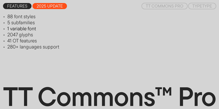
TT Commons™ Pro is a completely redesigned version of the well-established classic font family TT Commons.
- 60% off Special offer is valid until 27 Dec, 2024
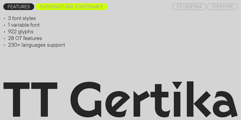
TT Gertika is a geometric sans serif with a dynamic character and a dancing rhythm. This font’s idea originates from the lettering featured on an American poster from the late 1930s.
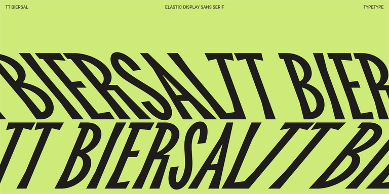
TT Biersal is a display sans serif with a free-spirited, playful, and adventurous nature. The concept of this font was sparked by a German poster from the early 1930s.
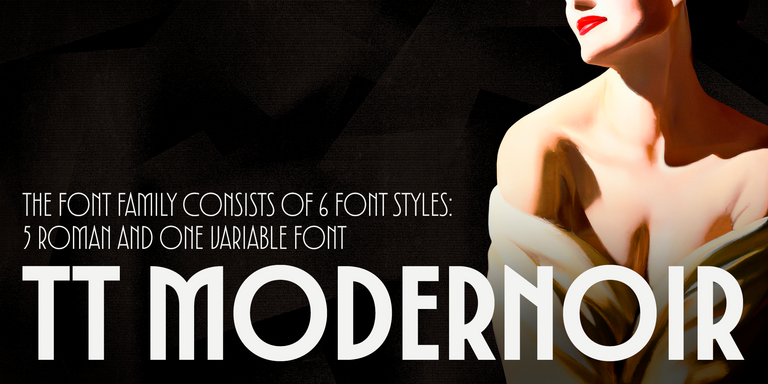
TT Modernoir is a display sans serif with dynamic proportions. Fluid lines and delicate Art Nouveau forms in this typeface blend seamlessly with the rhythmic flow and improvisational freedom of jazz.
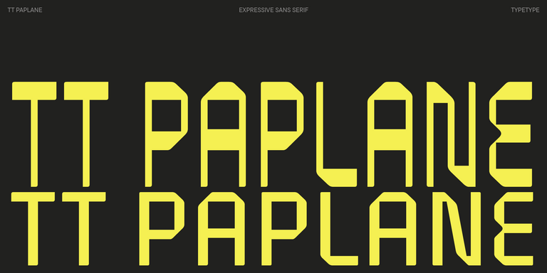
TT Paplane is a squared-looking display sans serif.
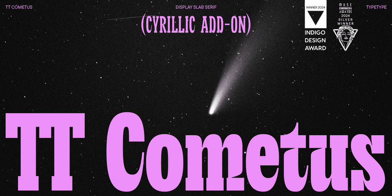
TT Cometus is an expressive typeface that captivates from the first time.
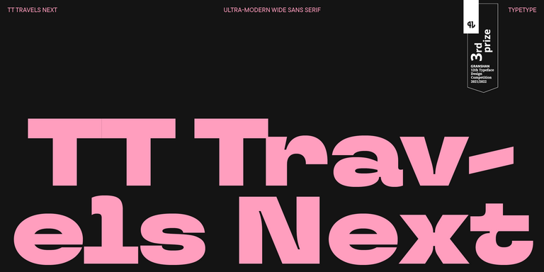
TT Travels Next is a very trendy and modern wide display sans serif for use in different sets, be they print or web.
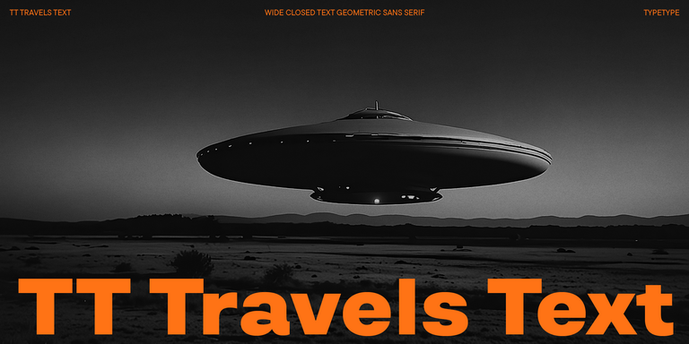
TT Travels Text is a geometric grotesque with wide proportions and specific shapes of circles and fillets, which includes two stylistic sets with completely different natures.
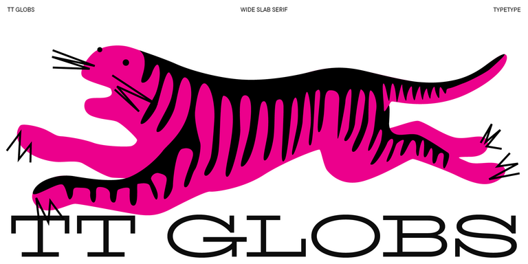
TT Globs is the first font from the TypeType Starter Kit line.
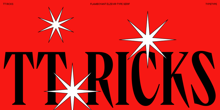
TT Ricks is a flamboyant elzevir-type serif, for which the words “cute” or “calm” are not a fitting definition.
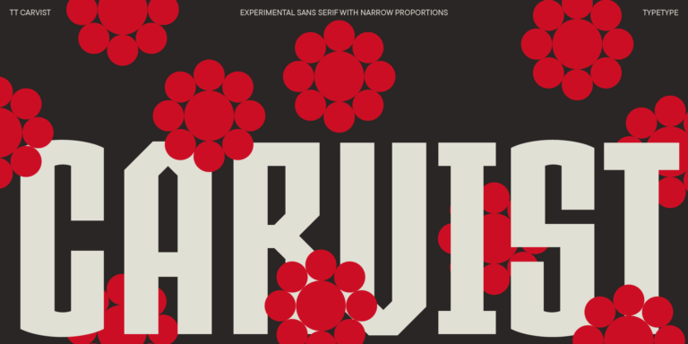
TT Carvist—peculiar, playful, and courageous—this font does an excellent job of grabbing attention!
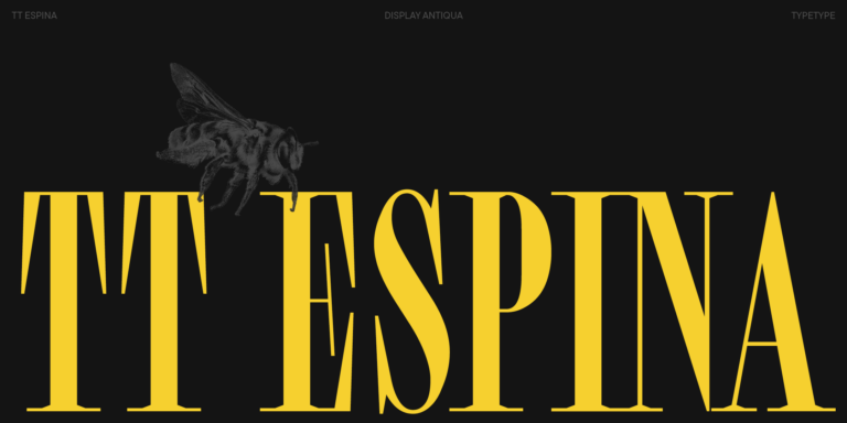
TT Espina is a display antiqua with expressive serifs
If you’re searching for the best experimental fonts to complement your design, TypeType studio is the one to provide a wide range of typefaces suitable for commercial purposes. The specific styles and the complete font families can be found on our page online: you may choose from a variety of well-made and technically verified fonts, use them for free and leave a request to buy a suitable license type. TypeType gives an opportunity to download the trial versions of all experimental fonts for you to use in your projects, as well as to get advice from design or client care teams. Feel free to contact us by our form on the web-site.
Drop your email, spin the wheel, and score some awesome discounts on our fonts!
* The discount cannot be combined with other offers and promo codes
- Compilations
- Development
Mind blowing examples of experimental typography
Typography is often thought of in its practical form, as text on a web page or printed material.A designer may look at typography in the way that it will impact their design, considering aspects such as spacing, leading, weight and size.But let’s put all of that aside as we take a look at typography used […]
Posted May 31, 2011
Typography is often thought of in its practical form, as text on a web page or printed material.
A designer may look at typography in the way that it will impact their design, considering aspects such as spacing, leading, weight and size.
But let’s put all of that aside as we take a look at typography used as an experimental form of art.
In this post we feature over 100 amazing typographical experiments, crazy compositions and funky fonts that ooze creativity.
These examples were collected from Behance’s Typography Served , a truly amazing resource for all typeface enthusiasts.
You can read more about each piece and their authors by clicking on the respective images below. Enjoy!
What do you think of experimental typography? Share your thoughts and comments below…
MOST POPULAR
Pinterest predicts design trends for 2025.
Louise North
Apple Releases Its Picks for the Best Apps of 2024
Css wrapped 2024: 17 features transforming modern web design.
Alex Harper
Will Craigslist Ever Get a Redesign? The Internet’s Most Stubborn Dinosaur
Shopify releases the boring edition: winter 2025.
In a world where even government websites are undergoing sleek makeovers, Craigslist remains a stubborn relic of the early 2000s internet. With its stark blue links, minimal design, and zero-nonsense…
Designer Problems: “Make the Logo Bigger!”
Ah, the age-old cry of “Make the logo bigger!”—a phrase that echoes across boardrooms, email threads, and designers’ nightmares. For decades, graphic designers have faced this seemingly innocent request from…
The Heartfelt Story Behind CSS’s New Logo
In the fast-paced, technical world of web development, it’s easy to forget the human stories that lie behind the technology we use every day. Recently, the unveiling of CSS’s official…
Pinterest has unveiled its much-awaited 2025 trend forecast, offering a sneak peek into the creative directions set to define design, lifestyle, and branding aesthetics in the coming year. The trends…
Pantone Unveils Color of the Year: Mocha Mousse
Pantone has unveiled its Color of the Year for 2025: Mocha Mousse (PANTONE 17-1230), a warm, soft brown that exudes comfort and sophistication. This selection reflects a cultural gravitation towards…
Take a look: Adobe’s 2025 Creative Trends Forecast
In a world that often feels both hyperconnected and disconnected, Adobe’s 2025 Creative Trends Forecast captures the essence of what today’s consumers are craving. It’s a fascinating mix of opposites—fantasy…
Join to our thriving community of like-minded creatives!

IMAGES
VIDEO
COMMENTS
Pair an experimental typeface with a simpler, more legible font that reiterates key messaging. Only use an experimental typeface with the finalized version of your UX copy. Don't use placeholder text or elements that will auto populate, such as a header tag for webpages or a blog. These typefaces require attention and care that only comes ...
Looking for Experimental fonts? Click to find the best 137 free fonts in the Experimental style. Every font is free to download!
(µ/ý XLŽ ^[D} H iHÚ f $ÉAˆ50 00ÿ(ÚoÖ+Ë-Òöq kوğêx‹à5õ# Ñ>ðŒo Ÿš„Vv¯í.;ÿˆñi' RÀVf ö VÂ5+'|ËUp > Ë#riSê'ùõgjyL8pÊ߉åá‹„î ‹êÖ˜r߶¢' Øoj©éw% ‡Ã Ÿ¨ì Q û ©ºN8l 'K9Ü—( ~Ó©^Ê BQšWTàKÑh@4 þâûÁµ„îØ0Q²1Õ\‚ Û º»;ï±F  k@d4 0 ù âƒË QJ3| OèªF43 ¨W8†0 U3 q‡p€A=Æ c|bÂ{c k¦OPxK*„U ...
The experimental typeface is your one design "trick;" keep the rest of the project streamlined visually. Support experimental typefaces with highly readable secondary fonts to ensure your message gets across. Create ample contrast, including color and space, for experimental options. Color and animated fonts may need more room to breathe ...
Unlock creativity with our free experimental fonts. Perfect for designers seeking unique typography. Explore now!
In typography design, experimental refers to anything unconventional that defies categorization and expectations.This might mean anything from intentionally breaking the rules of typography to experimenting with letter spacing and form spacing, alignments and combining various-sized fonts, stacking letters vertically and horizontally, or replacing letters with symbols.
Ready to find the best Experimental fonts that you can use to generate your own design? Browse and buy Experimental typefaces by TypeType for commercial use in your projects. Fonts. All fonts Licensing. Sans Serif fonts. Serif fonts. Display fonts. Script fonts. Slab Serif fonts. Variable fonts. Font sale. Font tester. Free fonts.
Ramose - Experimental Classic Display Serif Font. Image Credit: Envao Elements. Elegant and contemporary, Ramose is a serif font that doesn't quite fit the description of how serifs generally look like. Featuring 4 styles, this experimental font packs Regular, Oblique, Outline, and Oblique Oblique Versions.
But let's put all of that aside as we take a look at typography used as an experimental form of art. In this post we feature over 100 amazing typographical experiments, crazy compositions and funky fonts that ooze creativity. These examples were collected from Behance's Typography Served, a truly amazing resource for all typeface enthusiasts.
Another animated experimental typeface, Isotype is named after what it is: a faux 3D isometric typeface. This typeface has a number of in and out animations, controlled by two separate sliders, offering you full control over the speed and easing. Use this to add some oomph to headlines and phrases, and give your webpage a fun edge.