

How to choose the best font for a scientific presentation?
- April 11, 2022
- CAREER SKILLS

Are you the type of person who spends more time designing your presentation theme than creating the slides for the presentation the next day? Are you the type of person who wakes up in the middle of the night searching the internet for the best font for a scientific presentation?
Good! It means that you are passionate about being a better “communicator”. It does matter more than you think, especially in academia.
Presenting your work is as crucial as, if not more important than conducting research. Unfortunately, scientists have a reputation for being poor presenters. There is no purpose in doing research in the first place if one cannot communicate their knowledge. So, as future scientists, we should make a point to be good communicators.
A good presentation is a lot more than just “reporting” your research work. The mere goal of a presentation is to influence your listeners .
There should be some constraints in a professional setting to avoid unnecessary distractions. And you have to be careful to keep the presentation content simple and to the point. So, How to make a presentation that has all these elements?
The design choices we make in our presentations – the colours, the icons, the photography and illustrations – all form a kind of shorthand through which our audiences recognize the importance of the work we are doing and get a feel for the message we’re aiming to communicate.
The same rules apply to the fonts we use. Fonts have as significant an impact on design style as the visuals. Beautiful photography and well-designed icons can all be undermined by a poorly-chosen typeface. You should select a typeface that complements the rest of your design style and the essence you want to express. To put it another way, you’ll need a typeface with the appropriate’ voice.’
For instance, understanding enough about typefaces was one of Steve Jobs’ greatest advantages in becoming our generation’s Gutenberg. As he mentioned in one of his famous speeches,
Because I had dropped out and didn’t have to take the normal classes, I decided to take a calligraphy class to learn how to do this. I learned about serif and sans-serif typefaces, about varying the amount of space between different letter combinations, and what makes great typography great. It was beautiful, historical, artistically subtle in a way that science can’t capture, and I found it fascinating. How Steve Jobs became the Gutenberg of our times | TypeRoom
“The same way Gutenberg’s printing press gave rise to literacy in the late Renaissance era, Steve Jobs’ digital typefaces gave rise to design as something that is as important as the idea of creating. Everything” Loukas Karnis
The information below will help you choose the best font for your next scientific presentation.
Are you using Windows-standard font?
Custom fonts will be discussed later in this article, but one of the essential points to consider is whether the typeface you want to use is Windows-standard. If you create a stunning presentation using a custom font and then transfer it to a colleague who doesn’t have the font installed, the presentation will be a mess of mis-sized default fonts that isn’t fit for purpose.
So, if you intend to use your presentation on many machines, you’ll need a Windows-standard font that will work on all of them.
This is critical for a variety of reasons. For example, imagine you’re preparing a presentation for a conference.
There is a bigger chance that you might not be presenting on your laptop. Suppose you used a different font that does not come by default in presentation apps like Microsoft PowerPoint or Apple keynote.
In that case, the program will pick another similar font available. In a situation like this, the problem is that your presentation design might be slightly off if your font is different, leading to some serious problems.
I found myself in a similar situation at a conference; for example, some of my slides’ equations were completely off, and some were not even visible. Having to present in front of an audience on top of that additional pressure is not an empowering feeling.
There are two solutions for avoiding such situations:
(1) You can use a default font that comes with the presentation app you will use. There are so many elegant fonts there that come with the presentation apps.
(2) Or, if you want to stick with a specific font that does not come with the presentation app you are using, and if you cannot use your own laptop, you can quickly install the font on the laptop or PC you are using. If you do this at a conference, make sure to take care of it before the conference begins. Even if your presentation is after the coffee break, do not wait until the coffee break to install the font.
Serif or sans serif?
Serif fonts feature small ticks or ‘wings’ at the ends of their lines. They are typically associated with serious, business-like, intellectual content . In contrast, sans serif fonts have no marks on the ends of their lines and are usually regarded as modern, sleek, and clean.

Serif typefaces are superior for print and body text, according to conventional knowledge , since the serifs lead the eye from one character to the next like connected handwriting.
On the other hand, Sans serif fonts are ideal for titles and text displayed on a screen. These aren’t, however, hard and fast norms!
One popular option is to use one of each; for example, titles could be sans serif, and body text could be serif, but the choice is yours – go with what feels best for your presentation.
Factors that affect the readability
It might be good to go for ones that “aren’t built” to be tightly spaced. It provides breathing room within text and headings. It has a lighter appearance and is easier to read when adequately spaced.

Write content in sentence case. Title case can be used in proper titles, product names and service names. Avoid the use of all uppercase or “all caps” in your typography, especially for paragraphs or text.

Write content in sentence case. Proper titles, product names, and service names can all use title cases. In your typography, avoid using all uppercase or “all capitals,” especially for paragraphs or body content.
Belt and suspenders
In typography, the term “belt and suspenders” refers to the use of various styles to reach the same goal. Your presentation font should always be essential when emphasizing words, so keep styles to a minimum.

Avoid using more than two font sizes because it may confuse your audience and make your presentation seem complex. Make sure your font size is at least 18 points.

Best fonts for a scientific presentation
Having so many alternatives to choose from might be intimidating at times. However, in that case, you must ensure that the typefaces you choose have all of the necessary characteristics. As a result, limit yourself to a few fonts. Here are a few such fonts that can be used in any professional presentation.
The typeface Helvetica has been called “the little black dress” of typefaces. Helvetica is a versatile font that may be used in any professional presentation. It has been considered one of the best fonts for a scientific presentation

Read more about Helvetica :
The typeface that landed on the moon. This font is designed with three simple shapes. Circles, triangles and squares. It is one of the most readable typefaces due to its simplicity and is regarded as one of the best fonts for a scientific presentation.

Read more about Futura :
The theme of the font, Avenir is “A time for a font with a human touch”. It has a unique touch as the theme suggests that anybody would be comfortable reading content written in this font. Therefore, this font is especially well-suited to lengthy presentations.

Read more about Avenir :
Final words
It’s never easy to pick the best font for a scientific presentation. However, spending some time picking the correct font for your next presentation would not be a waste of time. Here are the key points for choosing the best font for your next scientific presentation.
- Use one, or a maximum of two, typefaces in your presentation
- Choose suitable font sizes (for titles, body copy) and use them consistently
- Be consistent with the use of bold, italics, or underline typefaces.
- Check if the conference or event has specific guidelines for formatting presentations and make sure to follow them
Images courtesy : Alphabet letters vector created by freepik – www.freepik.com , Photo by Markus Spiske on Unsplash
Aruna Kumarasiri
Founder at Proactive Grad, Materials Engineer, Researcher, and turned author. In 2019, he started his professional carrier as a materials engineer with the continuation of his research studies. His exposure to both academic and industrial worlds has provided many opportunities for him to give back to young professionals.
Did You Enjoy This?
Then consider getting the ProactiveGrad newsletter. It's a collection of useful ideas, fresh links, and high-spirited shenanigans delivered to your inbox every two weeks.
I accept the Privacy Policy
Hand-picked related articles

3 proven tips to build your online researcher identity as a graduate student
- October 6, 2022

3 Essential Features of a Great Academic Presentation
- July 5, 2022

How to make the most out of your first conference: 4 essential tips
- June 17, 2022
Leave a Reply Cancel Reply
Your email address will not be published. Required fields are marked *
Name *
Email *
Add Comment *
Notify me of follow-up comments by email.
Notify me of new posts by email.
Post Comment
5 fonts that add credibility and professionalism to scientific research
by ikumikayama | Apr 29, 2013 | Uncategorized | 14 comments

Choosing the right fonts can affect how your scientific research is received.
Note: This is part 2 of a 2-part blog series about choices in fonts. You can read part 1 here .
You are dressed in your best. You edited the manuscript with a fine-tooth comb…but are your figures and images wearing flip-flops?
Last time we talked about fonts that suck professionalism out of your scientific research . In this article, we’ll talk about fonts that actually add credibility and professionalism to your research. Dress your research in a custom-tailored suit by just using these fonts!
My friend and colleague, Cassio Lynm described how a good figure should be like a billboard found in many highways around the country. Anyone who sees the billboard will understand what they are advertising in a split second. If someone is confused or gets the wrong idea, the image is not very successful.
Similarly, the best professional fonts should be one that’s easy to read with very little “bells and whistles”. When writing prose of informational value such as scientific research, a reader should pay attention to what the text is describing, not how the text looks. A good professional font should be like air–we don’t really even pay attention to it most of the time.
Some of the fonts I’ll share with you today are considered “boring” and “overused” by some. These fonts are everywhere because they are champions of legibility and simplicity. Make your work professional and trustworthy by using a time-tested font.
[bra_divider height=’40’]
1. Arial- “All-Around Champion with IBM Roots”

According to fonts.com , Arial is one of the most used typefaces of the last 30 years. Its electronic origins go back to 1982 for IBM laser-xerographic printers by designers Robin Nicholas and Patricia Saunders. When it came out, it was supposed to compete with Helvetica, which was one of the core fonts in Apple Computers in the mid 1980’s.
Arial letters have more round shapes and the edges of letters do not end in a horizontal line. Instead, the edges are at an angle.
Arial is an easy-to-read font in small and large blocks of text. Nature requests that the figure text be in Arial or Helvetica. It’s especially nice for figure labels and legends. When using Arial as figure legends, keep the font size small ~8 points for best results.
2. Helvetica- “All-Around Champion with Apple Roots”

Helvetica is the most heavily-used font. Helvetica was originally designed by a Swiss designer named Max Miedinger in 1957. The font was designed to be an easy-to-read font. The name “Helvetica” comes from “Helvetia” – Latin name for Switzerland. Actually, the font received a facelift in 1983-the newer version is called, you guessed it, Neue Helvetica.
Helvetica even has its own movie . I haven’t seen it yet, but please comment in the section below if you have.
Besides its Hollywood (Indie) status, Helvetica is a font that looks great on both print and on screen. Nature , Science , and Cell request that their figure labels be in Helvetica. (If you need assistance setting up figures, I’m here to help). It looks great small as in figure labels, and it looks pretty good in large formats as posters. I lost count of how many figures I labeled using Helvetica, since that’s what one of the publishers used for their books.
3. Baskerville- “Tends to have positive influence on readers”

Baskerville’s history goes all the way back to 1757 when John Baskerville designed a typeface that works well in print and easy to read. Mr. Baskerville preferred his letters simple and refined. He was also a writing master, so he had some ornamental letters like the upper case Q.
There was an informal study (not official, but some experiments here and there) that showed using Baskerville font increased trustworthiness of the text compared to other fonts. In the same study, Comic Sans had the most negative influence on the readers.
Baskerville is a serif font, which means that there are “tails” at the edge of the letters. Generally, serif fonts are better suited for print. This font works best when used in long blocks of text. Try to keep this font between 8 and 14pts for best results. This font looks dignified, so use this for your important professional occasions-award ceremonies, recognitions, etc.
4. Caslon- “When in doubt, use Caslon”

Caslon is another font with a long history. William Cason I designed the typeface back in the early 1700’s. This font is considered as the first original typeface from England. This font was very popular in colonial America, and it was used for many historical documents including the US Declaration of Independence.
Caslon is a serif font (with tails), and is best used in blocks of text. Like Baskerville, try to keep this font between 8 and 14 points for best results. Using this in a report or an application would be a good places.
5. Garamond – “Second best font after Helvetica”

This font’s history also goes way back. The font was designed by Claude Garamond (or Jean Jannon), who was commissioned to make a typeface for King Francis I of France (1515-47) to be used in series of books. The modern, electric version was revived in 1989 by Robert Slimbach.
Because there are different sources available for Garamond, there are numbers of different variations of the font. Adobe Garamond is the most popular and widely-available version today.
Garamond is still used extensively by French publishers. They also insist that Garamond be printed in size 9. Some of the most famous publications in France are in Garamond such as Histoire de l’édition français. The publishers prefer this font “for its beauty, its richness and its legibility” combined with “an uncluttered graphic style that underscores the rigour of essays and analysis providing a radical critique of contemporary society”.
Garamond is a great font to be used in long proses such as textbooks, dissertations and theses. Keeping it at 9 point is optional. In fact, my master’s thesis was in Garamond.
So that’s the 5 fonts that add credibility and professionalism to your scientific research. Did you find your favorite fonts here? Do you have other favorites? Please share your thoughts in the comment section. Also, please feel free to send this article along to those who might benefit from this short article.
[bra_border_divider top=’10’ bottom=’10’]
Now that you know about great scientific fonts, learn more about: PowerPoint Tips for the Scientist

Sources and Further reading:
Arial vs Helvetica – fonts.com
Research on font trustworthiness: Baskerville vs. Comic Sans
Caslon typeface
History of Garamond
Cell Press Figure Guide
Nature -Guide to preparing final artwork
Science Magazine: Preparing your manuscript
14 Comments
I’d rather like to know which font was used to write that article – it’s simple and readable, better than all presented above.
And the font being used for that article is Helvetica, which is one of the fonts mentioned above 😀
Hi Ewa! Great point. The font used is called “Open Sans” by Steve Matteson. For my blog, I made the font color dark grey to make it easier on the eyes, and also made them slightly bigger than average for easier reading. Hope this helps!
Hollo there, i liked the article but none of this fonts looks like the one used in the papers i read, (Journals of the American Chemical Society), do you know which one they use?
Hi There! Thank you for the note! ACS suggests Arial and Helvetica for their journal figures, so that’s what I introduced in this article–for the text, they might very well have their own custom font they use for their publications. I’ll dig into this a little deeper–thank you again!
I’m sorry, but this article is full of misinformation. Part 1 is a reiteration of articles that have been around for years. Absolutely nothing new there, and honestly, is there anyone even considering the typefaces you name there for scientific articles? Is it conceivable that anyone would use Curlz for his essay?
But my real concern goes to the second part. Arial and Helvetica are absolutely not scientific typefaces. The notion that ACS suggests these typefaces doesn’t make them suitable for scientific works. I think you ought to do research as to WHY these typefaces came recommended. Helvetica has history, as it won out of contemporaries like Univers as Helvetica was very heavily marketed. As a side note, Helvetica is actually based on the Akzidenz Grotesk model. Arial was designed to have the same metrics as Helvetica so it could be used on the same printers without having to pay a license fee to use Helvetica. Arial is more legible while Helvetica is more neutral and clear, but neither is particularly great.
So I would say Helvetica and Arial haven’t been chosen because they’re perfect. They’ve been chosen because they’re popular, and Arial is on every Windows computer, so people don’t have to purchase any fonts. I would say neither Arial and Helvetica are known to be particularly good to read. I suspect typefaces like Proxima Nova and Avenir will fair better. To be clear, I don’t think Arial or Helvetica are bad choices for labels and such, but to suggest them as top 5 typefaces, that’s very clearly misinformation.
“When using Arial as figure legends, keep the font size small ~8 points for best results.” For best results? Not entirely. It’s probably a good estimate, but in actuality the pt size should depend on the layout. I would recommend always making a test print to see if the text looks good in print, if that’s what it is intended for. Sometimes 0.2pts more or less could make the difference.
“Helvetica is the most heavily-used font.” I don’t think so. First off, Helvetica is not a font. It’s a typeface. Helvetica Regular would be a font. Helvetica is the most heavily-used typeface in graphic design, and likely the most heavily-used sans typeface. It’s not the most heavily-used typeface. At least, I would be very surprised if it was. I suspect Times New Roman is the most heavily-used.
“The font was designed to be an easy-to-read font.” No, Helvetica was designed to steal the popularity of Akzidenz Grotesk away.
Also, follow this link to see some of the problems of Helvetica at small sizes, and what professionals in the field have to say about it: http://spiekermann.com/en/helvetica-sucks/
“Actually, the font received a facelift in 1983-the newer version is called, you guessed it, Neue Helvetica.” Who would guess that the prefix for the new Helvetica would be German though? Small detail… Anyway, if you like Helvetica but want a more professional typeface (because really, Max Miedinger was not a type designer and as far as I’m concerned that shows), I can recommend Neue Haas Grotesk (a typeface that is true to the original Helvetica, but improved) or Neue Haas Unica (a more fresh looking Helvetica that deviates from the original).
“Helvetica even has its own movie. I haven’t seen it yet, but please comment in the section below if you have.” I have seen it a few times now. It’s quite a pleasure to watch, but there’s a lot of propaganda involved as well. You have the likes of Massimo Vignelli drooling over how great Helvetica is. The man was a pretty great graphic designer (although insisting on always using Helvetica has little to do with graphic design, as one ought to select the perfect typeface for the job, not use one typeface for every job), but he had no insight in type design. On the other hand, you have Erik Spiekermann formulate perfectly what Helvetica stands for. I would say for a type designer the Helvetica documentary is quite pleasant to watch. For the layman I’m afraid the documentary amounts to propaganda. It gives the layman the feeling this is one of the best typefaces out there and it’s simply not, by far.
“Besides its Hollywood (Indie) status, Helvetica is a font that looks great on both print and on screen.” Absolutely not! On Windows computers, websites set in Helvetica tend to look horrendous. The problem is that Helvetica is not well hinted, and so rendering problems occur. Helvetica was obviously not designed for monitors. Neue Helvetica doesn’t have the rendering problem to the same extent I believe, but relatively few people have Neue Helvetica, so it wouldn’t be wise to use that on your website, unless you embed the fonts. For websites I highly recommend using Arial rather than Helvetica.
“Baskerville’s history goes all the way back to 1757 when John Baskerville designed a typeface that works well in print and easy to read.” Easy to read? Not particularly, though it’s not bad either. Baskerville is a transitional typeface, meaning the weight modulation is vertical and the contrast is high. This is the tradition of the Baroque, but it’s not the most pleasant to read. However, Baskerville does look quite academic. For typefaces that are more pleasant to read, I would look at the Garalde style. Garamond and Caslon belong to that classification. They have a diagonal weight modulation, which naturally leads the eyes to the next letters. Typefaces with vertical weight modulation and high contrast tend to feature a fence effect, which disturbs the reading experience. To see this effect well, look at Didone typefaces like Didot and Bodoni.
“This font works best when used in long blocks of text. Try to keep this font between 8 and 14pts for best results.” 14pt seems quite large. Try 9–12pt. This goes for any serif typeface to be used for body text that is intended for print (for the web try 10–14pt, also depending on which device it’s intended for). But again, it will depend on the layout, and always make test prints to make sure it’s pleasant to read.
“Garamond is a great font to be used in long proses such as textbooks, dissertations and theses. Keeping it at 9 point is optional. In fact, my master’s thesis was in Garamond.” I distinctly remember years ago I noticed my Harry Potter book was set in Garamond. Both Garamond and Caslon are still used extensively for books.
However, Garamond may be a bit much for scientific documents. It’s quite classical and it has a low x-height, which these days is not preferable. Caslon is a bit less expressive and has a taller x-height. I would say Caslon is probably better for scientific articles.
One group of typefaces that certainly seems to be missing here is Century. Typefaces like Century Roman and Century Schoolbook. They belong to the Clarendon classification and are reminiscent of typefaces like Baskerville. These typefaces have been popular since the late 19th century and are still used extensively in academic literature. But I suppose you should also make a consideration of whether your article should be about the most comfortable typefaces to read, or the best suitable for scientific work, because they most certainly don’t amount to the same thing, yet you seem to be equating the two in this article.
Hi Martin! Thank you so much for your in-depth note! I have to look over and digest all your excellent points. Would you be open to expanding your writing and be a guest author or send me a link to your website/blog so the readers can have more information about what types to use for their work?
THE quick brown fox jumps over the lazy dog!!!!!
Leelawadee is a bit underrated. It is easy on the eyes, and simple. It could use a bit of a TimesNewRoman-punch to it, though.
Where can I download Helvetica from? I couldn’t find it anywhere
Seriously? I don’t know what this smug guy does with typography, in which he seems to be well versed, but if he were to take up writing he would need to work on his grammar.
I’m not an expert on fonts, but I’m currently using Helvetica for headlines and other Sans text in my thesis and DejaVu for the main text. Feels pretty scientific to me 🙂
I enjoyed the historical aspect of this article. Thanks! PS. I see you use a sans serif font.
How i download these font types?
Which Fonts to Use on Your Scientific Poster
Choosing the right font (A.K.A. typeface) for your scientific poster is all about two things: readability and style.
But with thousands of fonts to choose from, it can be overwhelming.
So where do you start? You’ve come to the right place.
Here is what you need to know to choose a clear and stylish font for your scientific poster.

Serif or sans serif?
A serif font is one with those little bits on the end of the characters, the little moustaches. And, like a moustache, those little bits are just for style - they might be cool, but they’re not necessary.
What’s more, a serif font tends to give off a sophisticated, yet dated, vibe. As you want to your poster to reflect the innovative and contemporary research you’re conducting, it’s a good idea to stay away from serif fonts.

You need a font that is without serif, that’s sans serif. We recommend downloading your next favourite Sans Serifs fonts at Creative Fabrica . 👈
How many fonts?
Like so much of good design: less is more.
One or two fonts is all you need. If you have more fonts than this, your poster will look like a ransom note received in the mail.
As you know, it’s a good idea to make the headers clearly visible so help the viewer navigate the poster.
You can do this by making the headings bold or ALL CAPS. If you like the look of all caps, I strongly recommend against using any long headings. Long chucks of all caps is very difficult to read. So keep your headings short.
Decorative fonts
Look, I get it. You found the Disney font and you want to use it on your poster. A decorative font may be tempting, but it’s just not helpful - they’re very rarely easier to read than the standard sans serif fonts available. Take a look below to see what I mean.

Comic Sans?
Comic Sans is a sans serif font, it’s also fun - can we use it on our scientific posters?
Every time a scientist uses Comic Sans a graphic designer dies
BUT there is one exception. That is if your poster IS a comic!
If that’s the case, go for it! In this context Comic Sans is perfect and it would almost be a crime not to use it. Here’s a comic-style graphical abstract that is a perfect partner for the much maligned Comic Sans.

Bigger is better. At Animate Your Science, we believe posters are best served as a visual representation of your abstract. It’s about starting a conversation and that’s it - the rest is up to you.
So a poster with few elements, that can be seen from across the room, is perfect.
For this we recommend the following font sizes as a minimum for your text (based on an A0 size):
Headers : 40
Body text : 36
Your body text should be easily readable from 1 metre away.
To check that you have the right sizes, I suggest zooming in on your poster to 100 %. Then, take a step back to a metre or so. If you can clearly read the body text, then at a minimum, your text is big enough. You can use the same technique to test the sizes of your headers and title too.
Some suitable fonts
You have plenty of fonts to choose from. You’re not even limited to those default fonts installed on your computer. Check out Font Squirrel , Dafont , and 1001freefonts where you can download some new fonts for free.
For some ideas, check out these fonts:

That’s plenty of info dedicated to fonts for your scientific poster, so thanks for hanging in there with me.
But, we’ve only just scratched the surface on what makes a great scientific poster.
To properly cover this topic, we’ve developed a whole online course: How to Design an Award-Winning Scientific Poster. You can learn at your own pace and arm yourself with the tools, templates, skills and knowledge to create your own award-winning scientific posters. We’ve had excellent feedback on the 33 video lessons, 3 hours of learning and 8 templates & downloads included - so we’re confident that you’ll love it too.

Take-Away Points
One or two fonts
Sans serif is your friend
Make it large enough to be easily readable
Dr Tullio Rossi
Dr Flynn Slattery
#scicomm #poster #science
Related Posts
How to choose appropriate font sizes for your scientific poster
Scientific posters: a step-by-step planning guide
How to select the best images for your scientific poster
Commentaires

👀 Turn any prompt into captivating visuals in seconds with our AI-powered design generator ✨ Try Piktochart AI!
14 Fonts That Make Your PowerPoint Presentations Stand Out
Presentation fonts, more generally known as typography , are one of the most neglected areas of presentation design .
That’s because when presentation fonts are used appropriately and correctly, they blend so well with the overall design that your audience doesn’t even notice it. Yet, when your font usage is lacking, this sticks out like a sore thumb.
Over 30 million PowerPoint presentations are made daily. Therefore, when it comes to creating your own slide decks, you need to take every advantage you can get to make it stand out. Among other design choices, choosing the best fonts for presentations can provide a huge impact with minimal effort.
In fact, it’s one of the reasons why Steve Jobs was able to turn Apple into the brand it is today. His expertise in branding and design was fueled by the Calligraphy classes that he attended in his early years. This allowed him to find the best font family that accentuated his company’s brand and identity.
So no matter the subject of your PowerPoint presentation, the best font or font family will help you create a lasting impression and convey a powerful message. To help you shine through your next slideshow, here’s our cultivated list of the best fonts for presentations.
If you want to create a PowerPoint presentation but don’t have access to PowerPoint itself, you can use Piktochart’s presentation maker to create a presentation or slide deck and export it as a .ppt file.
Best Fonts for Presentations and PowerPoint
Before we proceed, you should know some basics of typography, especially the difference between Serif, Sans Serif, Script, and Decorative types of fonts.
Serif Fonts
These are classic fonts recognizable by an additional foot (or tail) where each letter ends. Well-known Serif fonts include:
- Times New Roman
- Century
Sans Serif Fonts
Differing from the Serif font style, Sans Serif fonts do not have a tail. The most popular Sans Serif font used in presentations is Arial, but other commonly employed renditions of Sans Serif typeface include:
- Century Gothic
- Lucida Sans
Script and Decorative Fonts
These are the fonts that emulate handwriting—not typed with a keyboard or typewriter. Script typefaces and decorative or custom fonts for PowerPoint vary immensely and can be created by a graphic designer to ensure these custom fonts are bespoke to your company/brand.
With these font fundamentals explained, you can also keep up-to-date with the popularity of such fonts using Google’s free font analytics tool here . Let’s now go ahead with our list of the best presentation fonts for your PowerPoint slides.
- Libre-Baskerville
Keep in mind that you don’t have to stick with only a single font for your slides. You could choose two of the best fonts for your presentation, one for your headings and another for the copy in the body of the slides.
Without further ado, let’s dive into the 14 best presentation fonts.
1. Helvetica

Helvetica is a basic Sans Serif font with a loyal user base. Originally created in 1957 , Helvetica comes from the Latin word for ‘Switzerland’ where it was born. When you use Helvetica, the top-half part of the text is bigger than in other Sans Serif fonts. For this reason, letters and numbers have a balanced proportionality between the top and bottom segments. As a result, this standard font makes it easier to identify characters from a distance.
As a result of being one of the easiest typecases to read compared to different presentation fonts, Helvetica is great for communicating major points as titles and subheadings in a Microsoft PowerPoint presentation.
For these reasons, Helvetica is a popular choice for anyone creating posters .
If you are presenting live to a large group of people, Helvetica is your new go-to font! The classic Sans Serif font is tried and tested and ensures the legibility of your slide deck, even for the audience members sitting at the very back. Though it looks good in any form, you can make Helvetica shine even more in a bold font style or all caps.

Futura is one of the popular Sans Serif fonts and is based on geometric shapes. Its features are based on uncomplicated shapes like circles, triangles, and rectangles. In other words , it mimics clean and precise proportions instead of replicating organic script or handwriting. Futura is a great default font for presentations because of its excellent readability, elegance, and lively personality.
As one of many standard fonts designed to invoke a sense of efficiency and progress, Futura is best employed when you want to project a modern look and feel in your presentation. Futura is a versatile option ideal for use in both titles and body content, accounting for why it has remained immensely popular since 1927.
3. Rockwell

The Rockwell font has strong yet warm characters that make it suitable for a variety of presentation types, regardless of whether it’s used in headings or the body text. However, best practice dictates that this standard font should be used in headers and subheadings based on its geometric style. Rockwell is a Geometric Slab Serif , otherwise known as a slab serif font alternative. It is formed almost completely of straight lines, flawless circles, and sharp angles. This Roman font features a tall x-height and even stroke width that provides its strong presence with a somewhat blocky feel.
Monoline and geometric, Rockwell is a beautiful font that can display any text in a way that looks impactful and important. Whether you want to set a mood or announce a critical update or event, you can’t go wrong with this robust font.

Verdana is easily a great choice as one of the top PowerPoint presentation fonts. Its tall lowercase letters and wide spaces contribute significantly towards boosting slide readability even when the text case or font size is small. That’s why Verdana is best for references, citations, footnotes, disclaimers, and so on. Additionally, it can also be used as a body font to extrapolate on slide headings to nail down your key points.
Besides that, it is one of the most widely available fonts, compatible with both Mac and Windows systems. This makes this modern Sans Serif font a safe bet for when you are not certain where and how will you be delivering your presentation.

Raleway is a modern and lightweight Sans Serif font. Its italicized version has shoulders and bowls in some letters that are a bit off-centered. What this means is that the markings excluding the stem are intentionally lower or higher as compared to other fonts.
This gives Raleway a slightly artistic look and feels without impacting its readability (and without falling into the custom or decorative fonts category). In fact, many professionals think the swashes and markings actually enhance the font’s readability and legibility. Moreover, Raleway also has a bold version which is heavily used in presentations and slide decks.

Here’s an example of a slide deck created with our AI presentation maker . The original font was Mada, but changing the text to Raleway gave the slide deck a modern feel, while also being easier to read. You can view the entire presentation here .
The bottom line is that Raleway is a versatile typeface that can be used in a variety of presentations, either in the body copy or in titles and subheadings. When the titles are capitalized or formatted as bold, captivating your audience becomes a breeze.
6. Montserrat
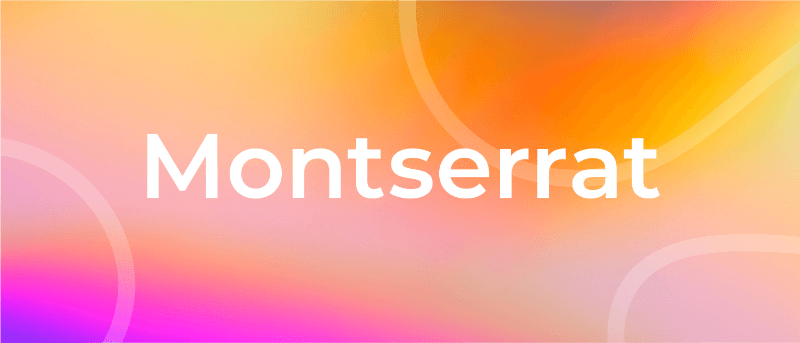
Montserrat is one of our favorite PowerPoint fonts for presentation titles and subheadings. The modern serif font is bold, professional, and visually appealing for when you want your headers and titles to really capture the audience’s attention.
Every time you move to the next slide, the viewers will see the headings and instantly understand its core message.
Another major quality of the Montserrat font is its adaptability and versatility. Even a small change, such as switching up the weight, gives you an entirely different-looking typeface. So you get enough flexibility to be able to use the font in all types of PowerPoint presentations.
Montserrat pairs nicely with a wide range of other fonts. For example, using it with a thin Sans Serif in body paragraphs creates a beautiful contrast in your PowerPoint slides. For this reason, it is usually the first modern Serif font choice of those creating a business plan or marketing presentation in MS PowerPoint.
Create powerful presentations with Piktochart
Piktochart is the easiest way to make powerful presentations. Import your own fonts.
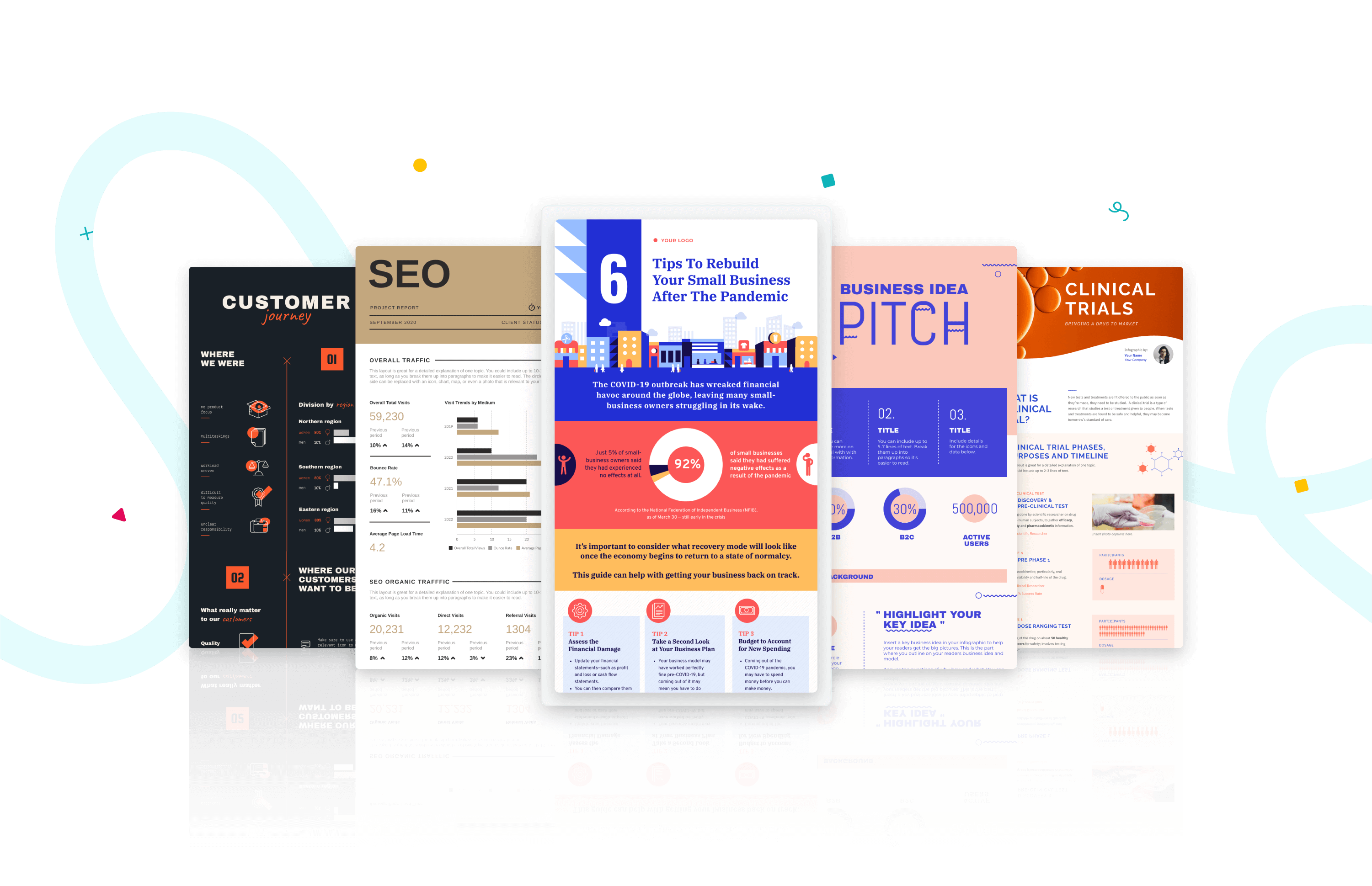
Roboto is a simple sans-serif font that is a good fit for PowerPoint presentations in a wide range of industries. Well-designed and professional, Roboto works especially well when used for body text, making your paragraphs easy to read.
Roboto combines beautifully with several other fonts. When you’re using Roboto for body text, you can have headings and titles that use a script font such as Pacifico, a serif font such as Garamond, or a Sans Serif font such as Gill Sans.

Bentham is a radiant serif font perfectly suited for headings and subtitles in your PowerPoint slides. It gives your presentation a traditional appearance, and its letter spacing makes your content really easy to read.
You can use this font in uppercase, lowercase, or title case, depending on how it blends with the rest of your slide. For best results, we recommend combining Bentham with a Sans Serif font in your body content. For example, you can use a font such as Open Sans or Futura for the rest of your slide content.
9. Libre-Baskerville
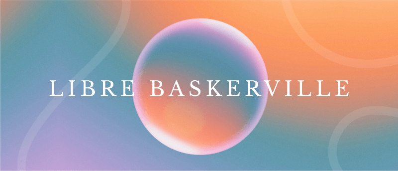
Libre-Baskerville is a free serif Google font. You can pair this classic font with several other fonts to make a PowerPoint presentation with a traditional design.
One of its best features is that it works equally well in both headings and body copy. It’s clear and easily readable, no matter how you use it. And when used for headings, it works really well in uppercase form.

Tahoma is one of the fonts that offer the best level of clarity for PowerPoint slides. It has easily distinguishable characters like Verdana, but with the exception of tight spacing to give a more formal appearance.
Designed particularly for screens, Tahoma looks readable on a variety of screen sizes and multiple devices. In fact, this significant aspect is what makes Tahoma stand out from other fonts in the Sans Serif family.
11. Poppins

Poppins falls within the Sans Serif font category but is a different font of its own uniqueness. The solid vertical terminals make it look strong and authoritative. That’s why it’s great for catchy titles and subheadings, as well as for the body paragraphs. Poppins is a geometric typeface issued by Indian Type Foundry in 2014. It was released as open-source and is available in many font sizes for free on Google Fonts.
When you want something that feels casual and professional in equal measure, pick Poppins should be in the running for the best PowerPoint fonts.
12. Gill Sans
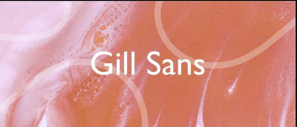
Gill Sans is another classic presentation font for when you’re looking to build rapport with your audience. Gill Sans is a friendly and warm Sans Serif font similar to Helvetica. At the same time, it looks strong and professional.
It’s designed to be easy to read even when used in small sizes or viewed from afar. For this reason, it’s a superior match for headers, and one of the best PowerPoint fonts, especially when combined with body text using Times New Roman or Georgia (not to mention several other fonts you can pair it with for successful results). This is the right font for combing different fonts within a presentation.
13. Palatino
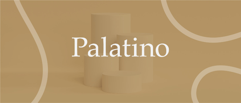
Palatino can be classified as one of the oldest fonts inspired by calligraphic works of the 1940s. This old-style serif typeface was designed by Hermann Zapf and originally released in 1948 by the Linotype foundry. It features smooth lines and spacious counters, giving it an air of elegance and class.
Palatino was designed to be used for headlines in print media and advertising that need to be viewable from a distance. This attribute makes Palatino a great font suitable for today’s PowerPoint presentations.
Palatino is also a viable choice for your presentation’s body text. It’s a little different from fonts typically used for body paragraphs. So it can make your presentation content stand out from those using conventional fonts.
14. Georgia

Georgia typeface has a modern design that few fonts can match for its graceful look. It’s similar to Times New Roman but with slightly larger characters. Even in small font size, Georgia exudes a sense of friendliness; a sense of intimacy many would claim has been eroded from Times New Roman through its overuse. This versatile font was designed by Matthew Carter , who has successfully composed such a typeface family which incorporates high legibility with personality and charisma. Its strokes form Serif characters with ample spacing, making it easily readable even in small sizes and low-resolution screens.
Another benefit of using this modern font is its enhanced visibility, even when it’s used in the background of your PowerPoint slides. Moreover, the tall lowercase letters contribute to a classic appearance great for any PowerPoint presentation.

Final Step: Choosing Your Best Font for Presentations
Choosing the right PowerPoint fonts for your future presentations is more of a creative exercise than a scientific one. Unless you need to abide by strict branding guidelines and company policies, there are no rules for the ‘best font’ set in stone. Plus, presentation fonts depend entirely on the environment or audience it is intended for, the nature and format of the project, and the topic of your PowerPoint presentation.
However, there are certain basic principles rooted in typography that can help you narrow down the evergrowing list of available PowerPoint presentation fonts and choose PowerPoint fonts that will resonate with and have a powerful impact on your target audience.
As discussed in this article, these include font factors such as compatibility with most systems, clarity from a distance, letter spacing, and so on. Luckily for you, our carefully researched and compiled list of best fonts for presentations above was created with these core fundamentals already in mind, saving you time and hassle.
As long as you adopt these best practices for standard fonts without overcomplicating your key message and takeaways, you’ll soon be on your way to designing a brilliant slide deck using a quality PowerPoint font or font family! From all of us here at Piktochart, good luck with your new and improved presentation slides that will surely shine!
If you want to spend less time designing from scratch, consider giving our AI presentation maker a try! From a single prompt, it will generate dozens of templates for you to choose from, along with suggested text and relevant images or charts and graphs. From there, you can pick the most suitable template and tweak it as you need, including color palettes and the text. Not to mention, picking the best font to make your message shine.

Other Posts
Graphic Design Trends 2025: 9 Key Predictions and Practical Applications

How to Write a Case Study
What Color is Vermilion? Its Meaning, Code & Combinations
Learn How To Choose The Best Font For Presentation
Choosing the best font for a presentation can make or break audience engagement. Find the best fonts that convey your ideas with clarity.
Imagine stepping onto a stage, ready to capture your audience with a riveting presentation. You’ve meticulously prepared every word, pieced together compelling data, and crafted visuals that will make an impact. Yet there’s one crucial element you might have overlooked: the font. Selecting the best font for a presentation is like choosing the right attire for an interview—it sets the first impression and rolls out the tone for what’s to come.
Introduction: Importance of Choosing the Right Font for Presentations
In this digital age, where presentations are ubiquitous across industries, choosing the right font has never been more significant. It’s not just about aesthetics; it pertains directly to how effectively you communicate your message. The importance of selecting a suitable font resonates through every PowerPoint presentation fonts every slide, the best presentation fonts every heading, and every bullet point on-screen.
Understand the Impact of Font Choice on the Effectiveness of a Presentation
Every choice in your presentation design contributes to how your audience comprehends and retains information. Your chosen font carries weight – quite literally in terms of design, as well as metaphorically speaking due to its psychological impact. A font can alter the reading speed, affect mood, and even influence interpretative reasoning. With carefully selected typography, you can enhance comprehension and persuade your audience more efficiently.
How Fonts Can Enhance or Detract from the Overall Message and Visual Appeal
Fonts possess their own personality—a silent voice that speaks volumes before a single actual word is registered by listeners. Choose one font correctly and watch your words leap off the screen with vibrancy and clarity; choose poorly and risk muddying your message or distracting viewers with unnecessary flamboyance or illegibility. Remember, while content is king, typeface is certainly the queen holding court over visual appeal—the sovereign guide leading eyes effortlessly from one point to another.
Serif Fonts: Classic and Timeless Options for Presentations
Explanation of serif fonts and their characteristics.
When you’re crafting a presentation, the font you choose is your silent ally—it conveys tone, reinforces the theme, and contributes significantly to first impressions. In that context, serif fonts are akin to a well-tailored suit: classic, timeless, and conveying a sense of authority. But what exactly makes a serif font style a serif?
Serifs themselves are the small lines or strokes attached to the end of larger strokes in letters. Picture the Times New Roman font; those little “feet” at the base of each character epitomize serifs. This style standard font itself has roots in ancient Roman inscriptions—a testament indeed to its enduring appeal.
The presence of serifs adds structure and formality to text that can lead one’s eye along lines of type—a boon for readability especially in print. However, it’s not just about utility: serifs also imbue text with an air of sophistication and credibility. And crucially for presenters, it’s this traditional nuance that often aligns with corporate or academic settings.
Best serif fonts for presentations, including examples like Times New Roman, Georgia, and Garamond
While there’s no one-size-fits-all answer when selecting your typographic partner-in-arms, several basic sans serif font fonts have proven particularly effective within presentation contexts:
- Times New Roman : The quintessential choice for delivering polished prose without distraction or risk – very much like choosing vanilla ice cream at a gelato shop full of exotic flavors.
- Georgia : Unlike the more compact Times New Roman, Georgia extends sideways with wider characters—an asset when projecting onto large screens where every millimeter matters.
- Garamond : If elegance had a typeface form, Garamond might be it; it brings an old-style feel that suggests tradition yet somehow doesn’t seem outdated.
Each font has its flair while maintaining clarity from afar—a critical factor during slide shows presented on projectors or monitors. Keep these choices in your arsenal as fail-safe options whether you’re aiming to persuade steadfast academics or engage seasoned professionals; they’re synergistic complements to any substantial content worth listening to—or better yet—acting upon after the applause fades out.
Sans Serif Fonts: Clean and Modern Choices for Presentations
Introduction to sans serif fonts and their attributes.
When you’re aiming for a sleek, contemporary vibe in other fonts in your presentation, sans serif fonts are my first recommendation. These thin sans serif fonts lack the small decorative lines—or serifs—at the ends of strokes that their counterpart serif fonts possess. The result is a clean and simplified look that’s highly adaptable to digital screens where clarity is paramount.
Attributes of sans serif fonts include:
- Simplicity : Their straightforward design cuts the frills away, leaving legible and uncluttered text.
- Modern Feel : They exude an aura of modernity and progressiveness.
- Versatility : Sans serif fonts can be incredibly versatile, functioning well across titles, body texts, and logos alike.
These characteristics have made modern sans serif font fonts immensely popular in not only presentations but also in web design and corporate branding.
Top sans serif fonts for presentations, such as Arial, Helvetica, and Calibri
Choosing the best PowerPoint fonts and the right top-quality PowerPoint font can truly transform your presentation’s impact. Here are some top sans-serif choices that combine readability with style:
- Arial : A ubiquitous font known for its wide availability and clear legibility. It works exceptionally well for both headings and body text.
- Helvetica : Celebrated for its versatility, Helvetica has gained almost legendary status in design circles. Its neutral appearance makes it suitable for any type of presentation.
- Calibri : Introduced as the default font in Microsoft Office applications, Calibri has become widely used due to its warm and soft character.
Each font from this trio brings something distinct to your presentation—Arial is like a reliable old friend; Helvetica gives off an air of professionalism; while Calibri feels more casual yet retains formality when needed. For a balanced classic presentation font that reads well without distracting from your message or visuals, integrating one of these popular sans serif font workhorses should be considered.
Script and Decorative Fonts: When to Use and When to Avoid
Discussion on script fonts and their appropriate usage in presentations.
When we turn our focus to the realm of script fonts, imagery of sweeping curves and elegant flourishes come to mind. Script fonts imitate the fluidity of human handwriting, often with various stroke weights and distinctive flair. They can instill a sense of personal touch or artistic sophistication into your slides. Yet, there’s a caveat; due to their intricate nature, they’re not always an effortless read from afar.
Appropriate use involves deploying script fonts sparingly. Consider them for:
- Title slides or introduction screens where you aim to make a bold statement
- Quotations that merit special attention or display touches of personality
- Specific industries such as wedding planning or luxury brands that benefit from their sophisticated vibe
A good guideline is if there’s emotional weight or stylistic nuance necessary, script fonts could be just what you need.
Considerations when using decorative fonts in presentations
On another note, decorative fonts are akin to wearing flamboyant clothing — they can dazzle but also overwhelm when used excessively. These eye-catching custom fonts can present unique styles that can complement themes ranging from retro to futuristic.
Before incorporating decorative typography consider these points:
- Legibility : Always preview these fanciful types at different sizes and distances to ensure legibility.
- Context relevance : Design elements should coalesce around your message rather than steer away from it.
- Text quantity : If you have dense text blocks, keep them in simpler font styles for ease of reading; reserve the razzmatazz for headers.
Remember that moderation is key with these expressive typefaces. Overuse confounds readability and may create visual chaos, diluting your core message. Whether it’s invoking elegance through a script font or stirring excitement with a decorative one, mindfulness about your audience’s experience will steer you right.
To sum up: while selecting scripts and decorative typefaces for your presentation can inject panache into individual slides, overuse may risk clarity for style—it’s about finding that sweet spot where design complements content without overshadowing it. Choose wisely!
Top Recommended Fonts for Presentations
Whether you’re aiming to convey innovation or instill confidence, the font you choose is a silent ambassador of your presentation’s message. Let’s delve into some of the top choices of standard fonts favored by presenters around the globe.
Helvetica: Versatile font suitable for various presentation themes
I would be remiss if I didn’t start with Helvetica. It’s not just a crowd-pleaser; it’s a chameleon in the world of typography. Born in 1957 in Switzerland, Helvetica has earned its reputation as an exceptionally versatile choice for almost any presentation theme, thriving equally well in corporate boardrooms and creative expos alike.
- Uniform and Neutral: Its clean, uniform lines are pleasing to the eye and don’t detract from your content.
- Legibility: With exceptional clarity, it’s easily readable even at a distance – crucial during presentations. When crafting slides that demand attention without overwhelming details, Helvetica stands as a reliable go-to font.
Futura: Modern font with geometric shapes for a contemporary look
Futura takes us on a journey back to 1927 but remains perpetually fresh and modern. This font dances gracefully across your screen with its combination of straight lines and circular forms—a nod to geometric shapes.
- Highly stylized yet supremely functional,
- Lends an air of sophistication to titles. Choosing Futura communicates a forward-thinking mindset while maintaining excellent readability. Bear in mind, that this particular typeface shines brightest when applied sparingly—ideal for headers or key points rather than body text.
Rockwell: Bold and impactful font ideal for emphasizing key points
Next up is Rockwell—a name that conjures up strength and solidity. Launched into typographical stardom in the early 20th century, its bold nature commands immediate attention:
- Heavyset Strokes: These make Rockwell impossible to ignore; perfect when highlighting critical data.
- Authoritative yet Approachable: Despite its strong demeanor, it retains an approachable warmth. Employ Rockwell judiciously to spotlight significant sections or reminders at the end of your presentation—ensuring they cement themselves in viewers’ minds long after curtains close.
Verdana: Clear and readable font suitable for online presentations or displays
As we navigate increasingly digital terrains, Verdana emerges as an indispensable ally—for it was designed specifically with screen legibility in mind by Matthew Carter in the late ’90s. What sets Verdana apart?
- Wide Proportions : Crafted to remain clear on low-resolution screens,
- Generous Spacing : Improves readability on various devices and resolutions. In today’s age where presentations often find their audience through pixels rather than projectors, selecting Verdana can be particularly wise for webinars or virtual meetings.
Raleway: Elegant font with a wide range of weights for added customization
Rounding off our recommendations is Raleway—a relatively new contender characterized by its elegance and versatility. Initially crafted as a display face, Raleway has evolved into a full-fledged family offering extensive weight variations:
- Lighter weights serve beautifully for delicate descriptions,
- Heavier options ensure impact where needed,
- Works harmoniously across print-outs and screens alike. Opting for Raleway offers designers creative freedom—allowing them to craft visually cohesive yet hierarchically intuitive slides tailored perfectly to each unique presentation context.
Each one of these fonts provides distinct advantages which makes them star contenders when deciding upon effective typography for your next presentation. Carefully consider not only how they look but how they harmonize with what you aim to achieve aesthetically and functionally within your slides’ framework.
Other Notable Fonts for Presentations
Crafting the perfect presentation involves an array of choices—one of which is selecting the right font. It’s not merely about aesthetics; choosing a custom font that complements your presentation can significantly impact how your audience processes the information you share. Beyond the most common choices, several other noteworthy presentation fonts deserve attention for their ability to provide visual clarity and add character to your slides.
Montserrat: Popular Font with Multiple Styles for a Cohesive Visual Identity
Montserrat has risen in popularity thanks to its geometric shapes reminiscent of classic urban typography from the mid-20th century. Its versatility is evident—offering numerous weights and styles to ensure consistency across varied content within your presentation. Starting from thin and delicate all the way to bold and assertive, Montserrat lends itself beautifully to headlines, captions, and every in between between.
Roboto: Humanist Sans Serif Font Known for Its Readability on Digital Screens
Roboto offers a harmonious blend of mechanical strength and friendly curves, creating a balanced presence on screen. This open-source sans-serif typeface was meticulously crafted for seamless legibility across mobile devices and desktops, making it a reliable choice for any digital presentation platform. With its natural reading rhythm, Roboto ensures that viewers absorb every word comfortably.
Bentham: Transitional Serif Font with a Classic Appeal
Bentham strikes through with elegance derived from traditional English typesetting. This transitional classic sans serif font family pairs excellently with more modern san serifs or even script fonts if contrasted correctly. The distinctive serifs draw attention yet don’t overpower—a thoughtful choice when imbuing your slideshow with a vintage or dignified mood.
Libre Baskerville: Traditional Serif Font with an Elegant Touch
Perfect for those who admire classic literature aesthetics, Libre Baskerville retains old-school charm while optimizing readability on digital screens. Its tall x-height makes it particularly clear when projected or displayed online – inviting focus onto key textual elements without causing strain.
Tahoma: Compact Sans Serif Font Suitable for Smaller Text and Captions
Tahoma stands out due to its letter spacing which helps maintain legibility even at smaller sizes—an ideal attribute considering footnote texts or detailed annotations in presentations. Moreover, Tahoma’s strong structure preserves clarity on lower-resolution screens where intricate details might otherwise be lost.
Poppins: Geometric Sans Serif Font That Works Well Across Different Screen Sizes
Poppins is as flexible as it is elegant—born from geometric shapes but softened with balanced proportions making each slide clear and visually pleasing no matter the viewing medium. The extensive family enables creative pairing amongst its varying weights, ensuring you express hierarchy effectively throughout every section of your talk.
Selecting among these notable fonts can bring coherence, sophistication, or modernity to your presentation depending on what it demands. Remember that each font carries its own personality—an aspect you can leverage to mirror the tone of your message skillfully.
Tips for Choosing the Best Font for Presentations
Selecting the right font for your presentation can be just as critical as the content PowerPoint presentation itself. This section will provide you with essential tips to help in choosing a font that not only complements your PowerPoint slides and message but also ensures it is delivered with clarity and impact.
Consider the theme and tone of your presentation
The essence of your presentation should guide your font choice. If you’re presenting on a solemn or formal topic, traditional serif fonts like Times New Roman or Garamond may reinforce your message’s gravity. Meanwhile, innovative projects might benefit from the sleek lines of popular sans serif fonts, such as Helvetica or Calibri, conveying modernity and progressiveness.
Take a moment to reflect on these themes before finalizing your typography:
- Formality versus casualness
- Traditional versus cutting-edge topics
- Audience expectations based on the subject matter
Aligning these elements harmonizes what I see on screen with what they hear from you, creating a seamless audience experience.
Ensure readability by selecting fonts with appropriate sizing and line spacing
It’s paramount that every person seated in the room—or joining virtually—can easily read your slides without squinting. Here’s how to make sure of that:
- Opt for larger fonts: A minimum size of 24pt should ensure visibility even at a distance.
- Pay attention to line spacing: Spaces between lines improve legibility, especially with blocks of text; aim for 1.2 to 1.5 times larger than character height.
These guidelines are crucial because if information on-screen isn’t immediately clear, engagement drops—so does retention of what you present.
Create visual interest through font pairing and contrast
Pairing different types of fonts adds dynamic interest to your slides while helping differentiate sections or highlight key points. For instance, contrasting a bold serif header with a simple sans serif font for body text can subtly draw attention to major headings without overpowering the finer details below.
When blending fonts:
- Limit yourself: Use no more than two to three complementary styles so as not to overwhelm viewers.
- Combine opposites: Match a bold header typeface with a lighter body font—it aids hierarchy signaling where focus ought to go first.
Remember, cohesion trumps complexity; legible contrasts outshine artistic clutter every time.
Use color effectively to enhance the presentation’s visual impact
Finally, color is another powerful tool at your disposal. It can reinforce branding, evoke emotions, and facilitate comprehension when used judiciously within presentations.
Consider these pointers when infusing color into typography:
- Contrast is king: Dark text on light backgrounds—and vice versa—yields maximum readability.
- Color coding concepts: Different hues can represent varying topics or sentiments articulated within spoken content.
However tempting it might be to splash myriad colors across each slide—resist! Restraint often equates to sophistication; an intelligently limited palette reflects well upon the presenter’s professionalism too.
By applying these considerations thoughtfully—in combination—I’ve uncovered confidence in producing visually appealing presentations that communicate key messages in compellingly clear-cut terms; now you’re primed to do likewise!
Conclusion: Making an Impression with Your Font Choice
The journey through the typographic landscape can be transformative for your slides, where the best font for presentation becomes a pivotal tool in your communication arsenal. It’s not just about making words legible; it’s about making them resonate. In closing, remember that each font carries its own weight and personality—crafting distinct tones, rhythms, and auras that imbue your message with character.
Restate the importance of choosing the right font for presentations
Crafting compelling presentations goes beyond well-researched facts and figures; the aesthetic elements play a fundamental role in how audiences engage with your content. Choosing the optimal font is crucial—it’s how you ensure clarity, establish mood, underscore important points, and demonstrate professionalism. Make no mistake; a well-chosen font has the power to captivate or lose an audience’s attention within moments.
Summarize key considerations and tips for selecting an impactful font
I urge you to consider these factors as you select fonts:
- Alignment with the theme & tone: Ensure that your font echoes the subject matter and emotion of your presentation.
- Readability: Aim for clarity at various sizes and distances; Optimal sizing and line spacing are your allies here.
- Compatibility across devices: Ensuring consistency on different screens safeguards against unintended display issues.
- Contrast & Pairing: Embrace contrast thoughtfully to draw attention. Experiment with pairing fonts to build dynamic hierarchies within your text.
Empower readers to make informed decisions about their font choices in future presentations
You’re now equipped with insights into what makes a great presentation font—from modern serif font classics like Garamond to robust sans serifs like Helvetica. But consider this just the beginning. I encourage you to explore further—the world of typography is vast and ripe for those willing to delve deep—to develop a discerning eye for the type that will continually add sophistication and impact to your work.
Let every slide reflect intentional design by choosing typefaces that not only convey but amplify your message. Harness this knowledge as both compass and tool, guiding you as you carve out narratives that resonate long after the curtains close. Now go forth—with every word purposefully cast—you stand ready to leave indelible imprints on minds and hearts alike with the best font for a presentation tailored just for you.
Mind the Graph: your next favorite presentation tool
Are you tired of boring presentations created with low-quality Google images? Get to know Mind the Graph and its amazing design features that will help you create beautiful presentations with the best fonts and even better illustrations. Sign up for free and start exploring their gallery of more than 300 templates to inspire your next creations.
Subscribe to our newsletter
Exclusive high quality content about effective visual communication in science.
About Fabricio Pamplona
Fabricio Pamplona is the founder of Mind the Graph - a tool used by over 400K users in 60 countries. He has a Ph.D. and solid scientific background in Psychopharmacology and experience as a Guest Researcher at the Max Planck Institute of Psychiatry (Germany) and Researcher in D'Or Institute for Research and Education (IDOR, Brazil). Fabricio holds over 2500 citations in Google Scholar. He has 10 years of experience in small innovative businesses, with relevant experience in product design and innovation management. Connect with him on LinkedIn - Fabricio Pamplona .
Content tags

Research Poster Presentation
- Planning & Preparation
- Layout & Content
- Color Scheme
- Images & Graphics
- Review & Printing
Beginning Graphic Design: Typography
Best Practices
Choose your fonts
For maximum impact, choose different fonts for the header and body of your poster. Select a serif font for your title and a sans serif font for the body. Serif fonts, such as Times New Roman and Garamond, have short lines at the ends of the strokes in a letter (as indicated by the arrows in the images below); sans serif fonts, such as Helvetica and Arial, do not.

Some common font pairings and recommended font sizes can be found below.

Size appropriately

- 33 perfect font pairings
- The art of mixing typefaces - Google Fonts edition
- The ultimate guide to font pairing
- Poster Design And Layout: From Font Sizes To Color Contrast
- << Previous: Color Scheme
- Next: Images & Graphics >>
- Last Updated: Oct 17, 2024 2:15 PM
- URL: https://researchguides.wcu.edu/researchposter
HUNTER LIBRARY
176 Central Drive Cullowhee, NC 28723 Administration: 828-227-7485 Reference: 828-227-7465 Circulation: 828-227-7485

QUICK LINKS
Ask-A-Librarian Reserve a Study Room My Account Library Catalog Article Databases Interlibrary Loan

IMAGES
COMMENTS
Mar 4, 2024 · This list will help you find the best font for your next presentation, regardless if you’re using PowerPoint, Google Slides, Keynote or any other tool to create it.
Apr 11, 2022 · Here are the key points for choosing the best font for your next scientific presentation. Use one, or a maximum of two, typefaces in your presentation Choose suitable font sizes (for titles, body copy) and use them consistently
Apr 29, 2013 · When writing prose of informational value such as scientific research, a reader should pay attention to what the text is describing, not how the text looks. A good professional font should be like air–we don’t really even pay attention to it most of the time.
Mar 9, 2021 · Choosing the right font (aka typeface) for your conference poster is all about two things: readability and style. Here is what you need to know to choose a clear and stylish font for your scientific poster.
Mar 29, 2022 · Choosing the right font for the right kind of content is imperative, this article will aid your decision when it comes to scientific fonts. Your visual abstracts can be beautiful with Mind the Graph. Learn how to create them in this special post with design tips for scientists.
Nov 18, 2024 · We’ve made a list of the best PowerPoint fonts for your presentations! From Rockwell to Bentham, these fonts help you make an impact.
Apr 28, 2021 · Arial is the safest you can get. Calibri is also super safe. If you know the other computers will have Microsoft Office 365 and internet connection, you could use one of the Microsoft cloud fonts. These five are especially clean: https://www.microsoft.com/en-us/microsoft-365/blog/2021/04/28/beyond-calibri-finding-microsofts-next-default-font/
Apr 17, 2022 · imho, stay away from Serif fonts like Times and Courier. Experiment with sans serifs like Roboto, Monserrat, or maybe look into mono space fonts if you wanna be real nerdy and precise. Have a look at the most popular fonts on Google Fonts. Most of them are great and versatile.
Feb 10, 2024 · Best serif fonts for presentations, including examples like Times New Roman, Georgia, and Garamond. While there’s no one-size-fits-all answer when selecting your typographic partner-in-arms, several basic sans serif font fonts have proven particularly effective within presentation contexts:
Oct 17, 2024 · Choose your fonts. For maximum impact, choose different fonts for the header and body of your poster. Select a serif font for your title and a sans serif font for the body.